MENU
Event branding for the Prineville Ride About Bike Parade. This is a bike-focused fun event taking place each year on St.Patricks Day weekend. The goal of the branding was to be fun and whimsical so that even non-cyclists would feel encouraged to come have fun on a bike for the day.
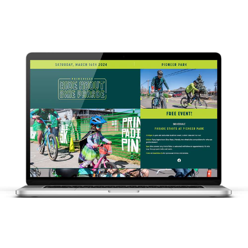
VISIT PRINEVILLERIDEABOUT.COM
Event branding for the Prineville Ride About Bike Parade. This is a bike-focused fun event taking place each year on St.Patricks Day weekend. The goal of the branding was to be fun and whimsical so that even non-cyclists would feel encouraged to come have fun on a bike for the day.
Event branding for the Prineville Ride About Bike Parade. This is a bike-focused fun event taking place each year on St.Patricks Day weekend. The goal of the branding was to be fun and whimsical so that even non-cyclists would feel encouraged to come have fun on a bike for the day.

Event branding for the Prineville Ride About Bike Parade. This is a bike-focused fun event taking place each year on St.Patricks Day weekend. The goal of the branding was to be fun and whimsical so that even non-cyclists would feel encouraged to come have fun on a bike for the day.
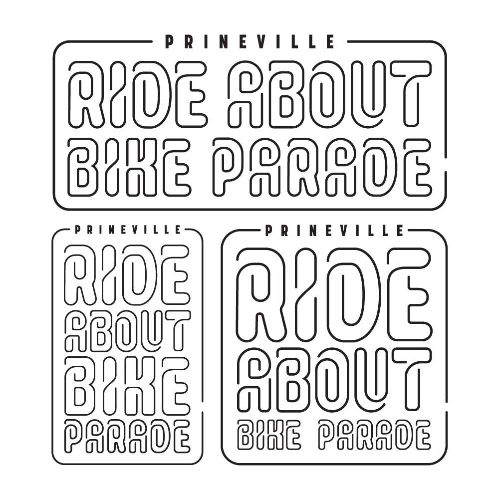
Event branding for the Prineville Ride About Bike Parade. This is a bike-focused fun event taking place each year on St.Patricks Day weekend. The goal of the branding was to be fun and whimsical so that even non-cyclists would feel encouraged to come have fun on a bike for the day.

VISIT GIRLBEHEARD.ORG
Girl Be Heard! is a Brooklyn, New York based performance art studio for young women and gender non-conforming youth. Each year they have a new program theme for their performances, and I was fortunate to be asked to create the 2022-2023 theme identity, ORGANIZE! The logo and visual elements speak to the ability of individuals to come together and form a movement much more powerful than any one individual.

VISIT GIRLBEHEARD.ORG
Girl Be Heard! is a Brooklyn, New York based performance art studio for young women and gender non-conforming youth. Each year they have a new program theme for their performances, and I was fortunate to be asked to create the 2022-2023 theme identity, ORGANIZE! The logo and visual elements speak to the ability of individuals to come together and form a movement much more powerful than any one individual.
VISIT GIRLBEHEARD.ORG
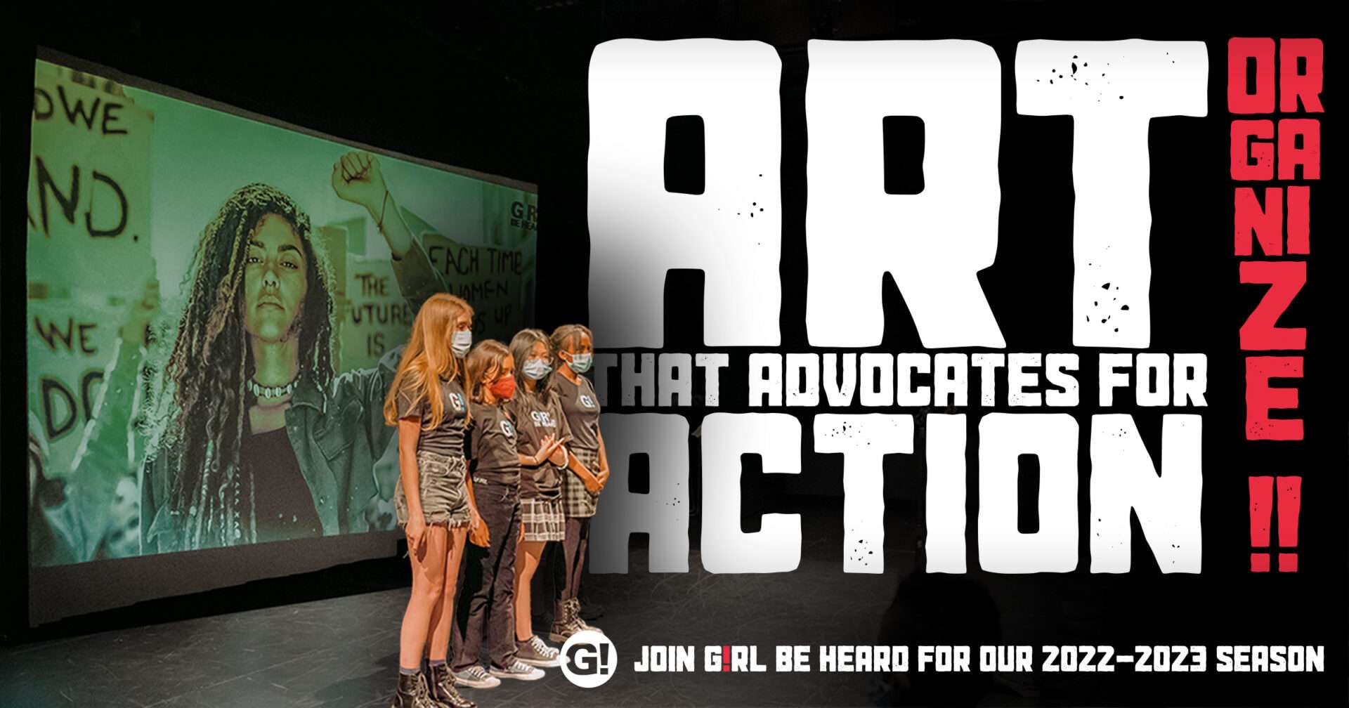
Girl Be Heard! is a Brooklyn, New York based performance art studio for young women and gender non-conforming youth. Each year they have a new program theme for their performances, and I was fortunate to be asked to create the 2022-2023 theme identity, ORGANIZE! The logo and visual elements speak to the ability of individuals to come together and form a movement much more powerful than any one individual.
VISIT GIRLBEHEARD.ORG
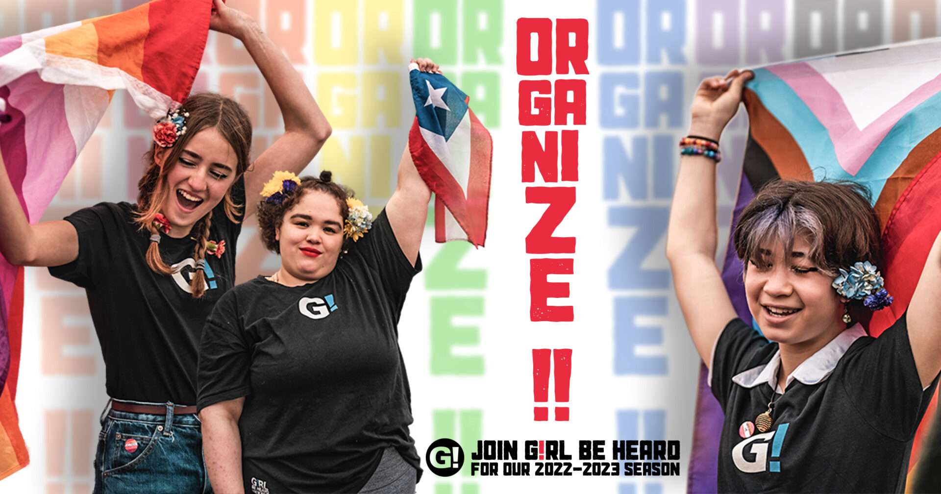
Girl Be Heard! is a Brooklyn, New York based performance art studio for young women and gender non-conforming youth. Each year they have a new program theme for their performances, and I was fortunate to be asked to create the 2022-2023 theme identity, ORGANIZE! The logo and visual elements speak to the ability of individuals to come together and form a movement much more powerful than any one individual.

VISIT GIRLBEHEARD.ORG
Girl Be Heard! is a Brooklyn, New York based performance art studio for young women and gender non-conforming youth. Each year they have a new program theme for their performances, and I was fortunate to be asked to create the 2022-2023 theme identity, ORGANIZE! The logo and visual elements speak to the ability of individuals to come together and form a movement much more powerful than any one individual.
VISIT GIRLBEHEARD.ORG
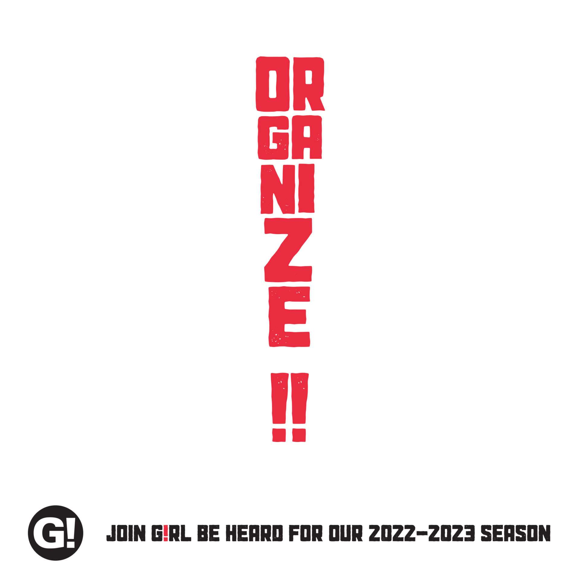
Girl Be Heard! is a Brooklyn, New York based performance art studio for young women and gender non-conforming youth. Each year they have a new program theme for their performances, and I was fortunate to be asked to create the 2022-2023 theme identity, ORGANIZE! The logo and visual elements speak to the ability of individuals to come together and form a movement much more powerful than any one individual.

Ochoco Trails was a grassroots trail advocacy group comprised of a full range of outdoor trail users in Central Oregon; including cyclists, equestrians, hikers, hunters and more. The brand uses the colored panels to represent this diversity of users all working together collaboratively. Together they form a stylized representation of Lookout Mountain, the highest peak in the Ochoco National Forest. OCHOCOTRAILS.ORG
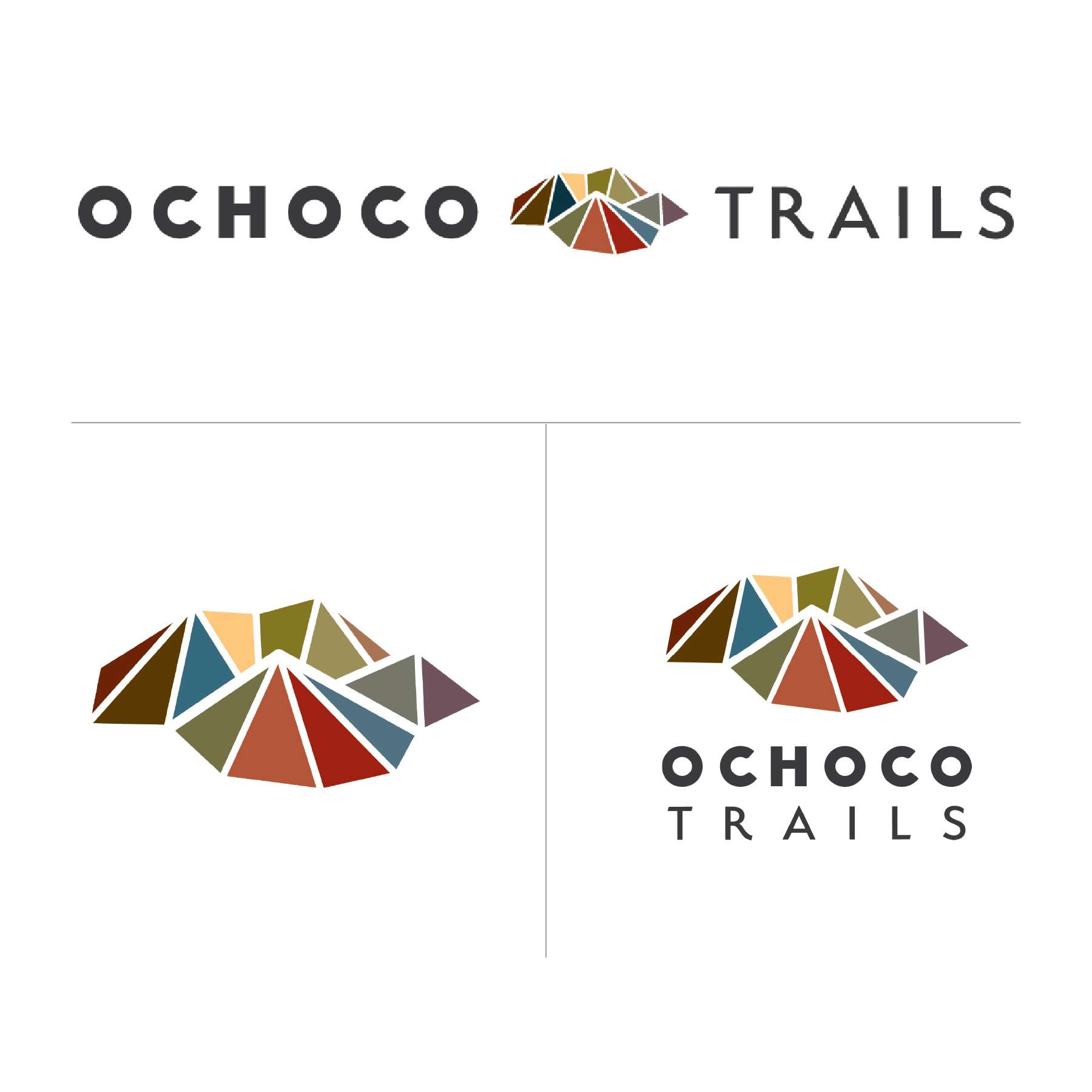
Ochoco Trails was a grassroots trail advocacy group comprised of a full range of outdoor trail users in Central Oregon; including cyclists, equestrians, hikers, hunters and more. The brand uses the colored panels to represent this diversity of users all working together collaboratively. Together they form a stylized representation of Lookout Mountain, the highest peak in the Ochoco National Forest. OCHOCOTRAILS.ORG
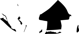
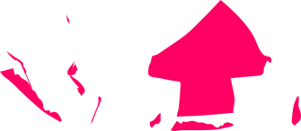
The icon can be used in monotone colors to call out specific concepts in a design.
Ochoco Trails was a grassroots trail advocacy group comprised of a full range of outdoor trail users in Central Oregon; including cyclists, equestrians, hikers, hunters and more. The brand uses the colored panels to represent this diversity of users all working together collaboratively. Together they form a stylized representation of Lookout Mountain, the highest peak in the Ochoco National Forest. OCHOCOTRAILS.ORG
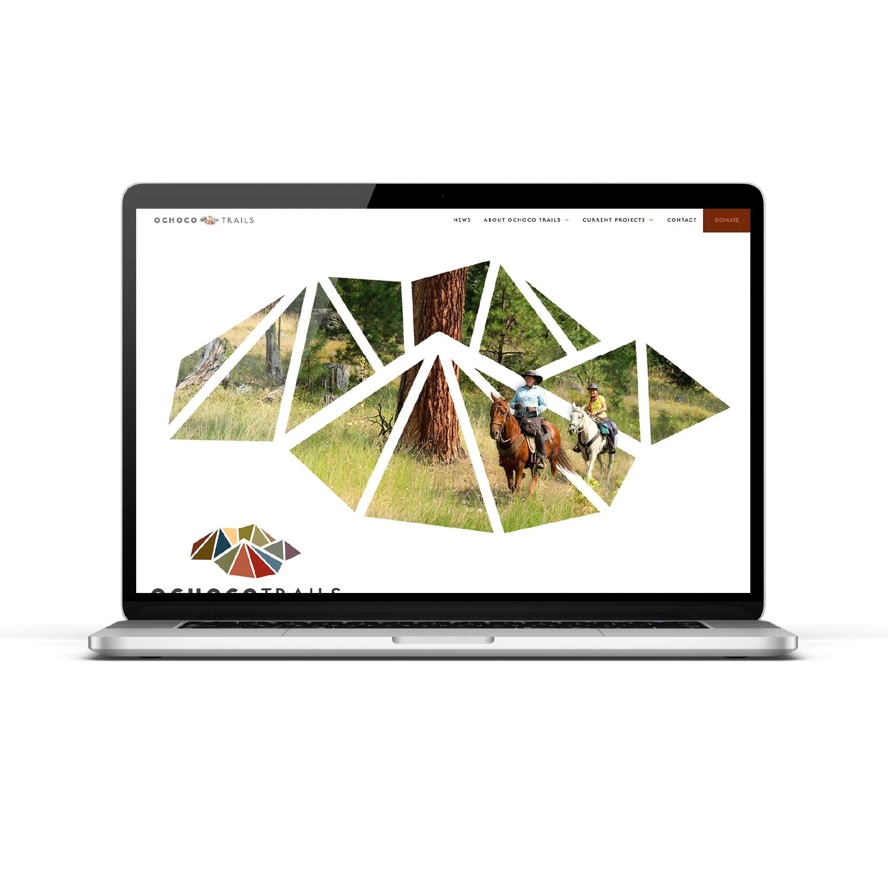
Ochoco Trails was a grassroots trail advocacy group comprised of a full range of outdoor trail users in Central Oregon; including cyclists, equestrians, hikers, hunters and more. The brand uses the colored panels to represent this diversity of users all working together collaboratively. Together they form a stylized representation of Lookout Mountain, the highest peak in the Ochoco National Forest. OCHOCOTRAILS.ORG

Ochoco Trails was a grassroots trail advocacy group comprised of a full range of outdoor trail users in Central Oregon; including cyclists, equestrians, hikers, hunters and more. The brand uses the colored panels to represent this diversity of users all working together collaboratively. Together they form a stylized representation of Lookout Mountain, the highest peak in the Ochoco National Forest. OCHOCOTRAILS.ORG

Ochoco Trails was a grassroots trail advocacy group comprised of a full range of outdoor trail users in Central Oregon; including cyclists, equestrians, hikers, hunters and more. The brand uses the colored panels to represent this diversity of users all working together collaboratively. Together they form a stylized representation of Lookout Mountain, the highest peak in the Ochoco National Forest. OCHOCOTRAILS.ORG