

MENU
Soriano Law
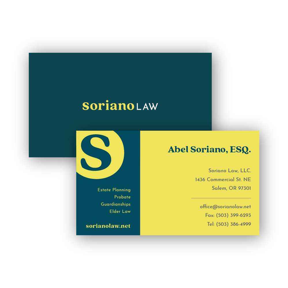
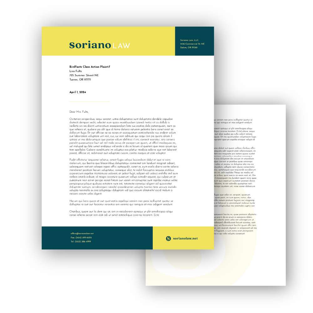
Soriano Law is a boutique law firm specializing in estate planning and with a focus on friendly, approachable service. They needed a fresh brand to reflect this personal approach and set themselves apart from large firms that often are generic, impersonal and intimidating to new clients.

As a small, boutique law firm, Soriano Law must differentiate themselves from larger practices. They have identified their friendly, highly approachable atmosphere as one of their biggest strengths and something which larger firms cannot compete with.
The branding needed to reflect this characteristic while at the same time still presenting them as a professional trustworthy practice.
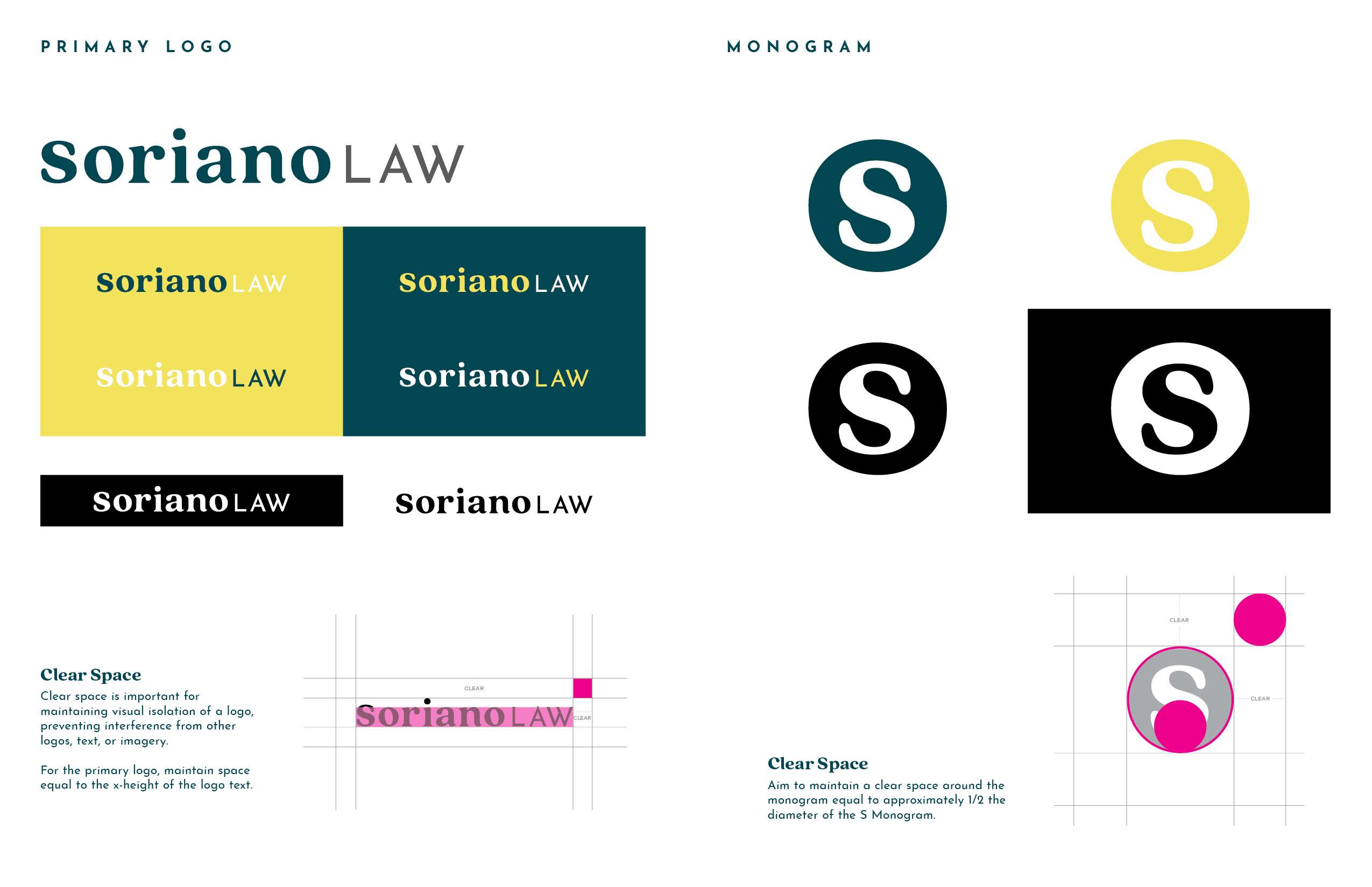
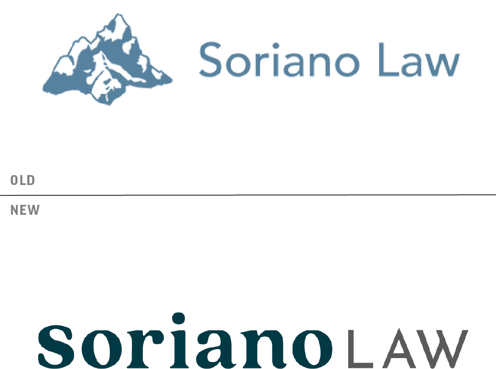
The primary logo combines a bold serif with a charming humanist quality (Soriano), with a simple geometric sans serif (LAW) for a word mark that is both professional and welcoming.
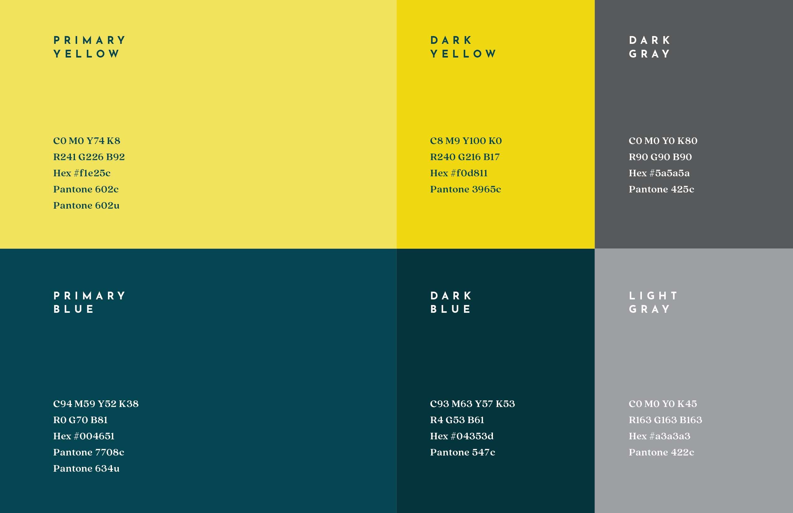
The Soriano Law color palette is a big part of the brand as well. The wide use of yellow is immediately distinctive from just about any other law firm out there. It immediately shows clients that this is a firm with a unique approach. The teal blue then provides a sense of trust and reassurance that while they eschew the stodginess of other firms, they treat every case with total expertise and professionalism.

sorianolaw.net
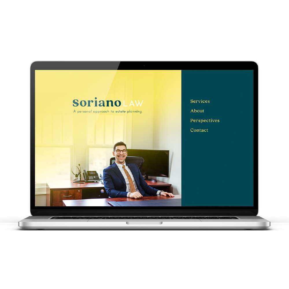
The new website uses the brand to present the firm in a much cleaner more directed way. The content is organized neatly to make navigation easy and users are always presented with a quick and easy way to get in touch.