MENU
MotoButler Brand Identity
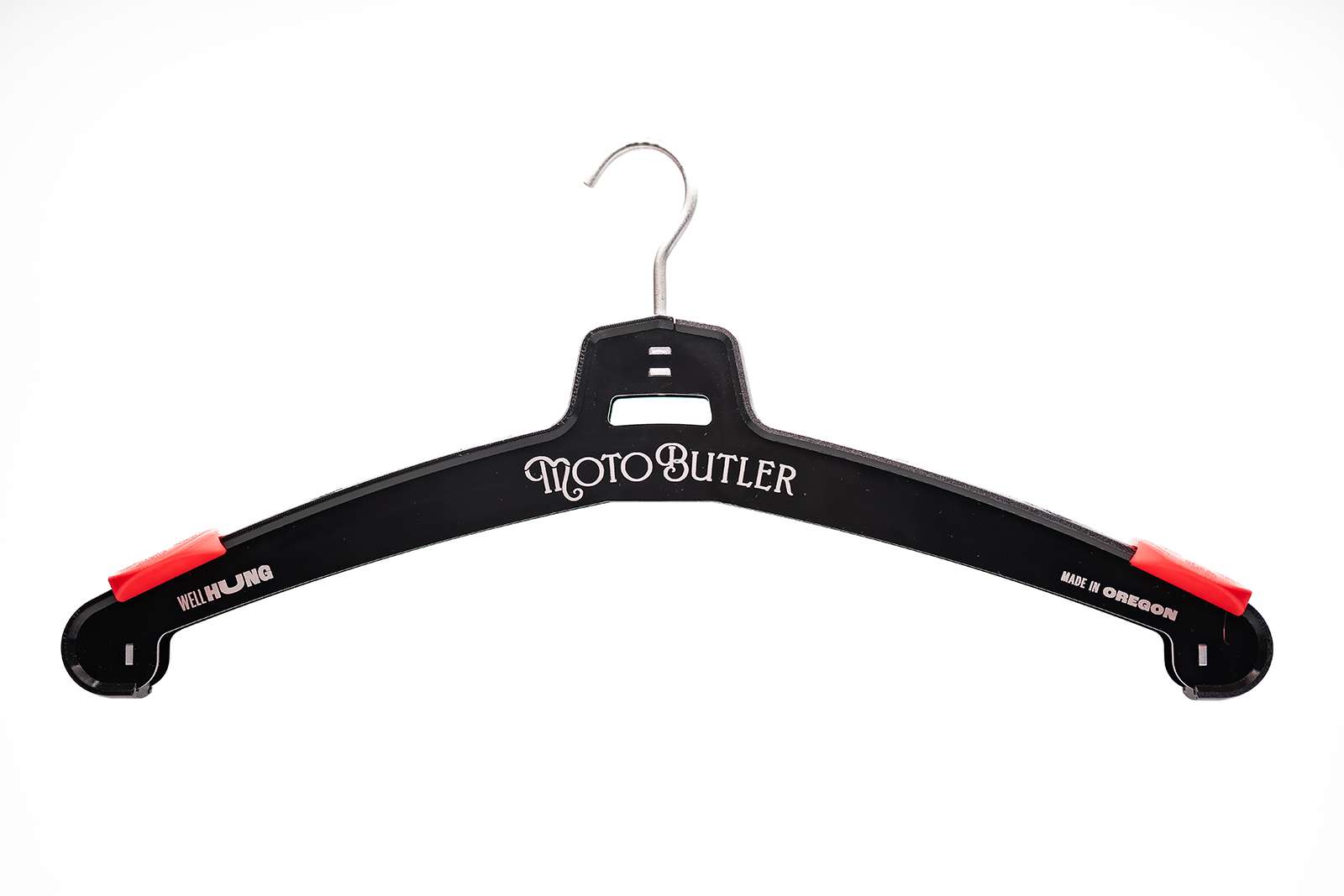
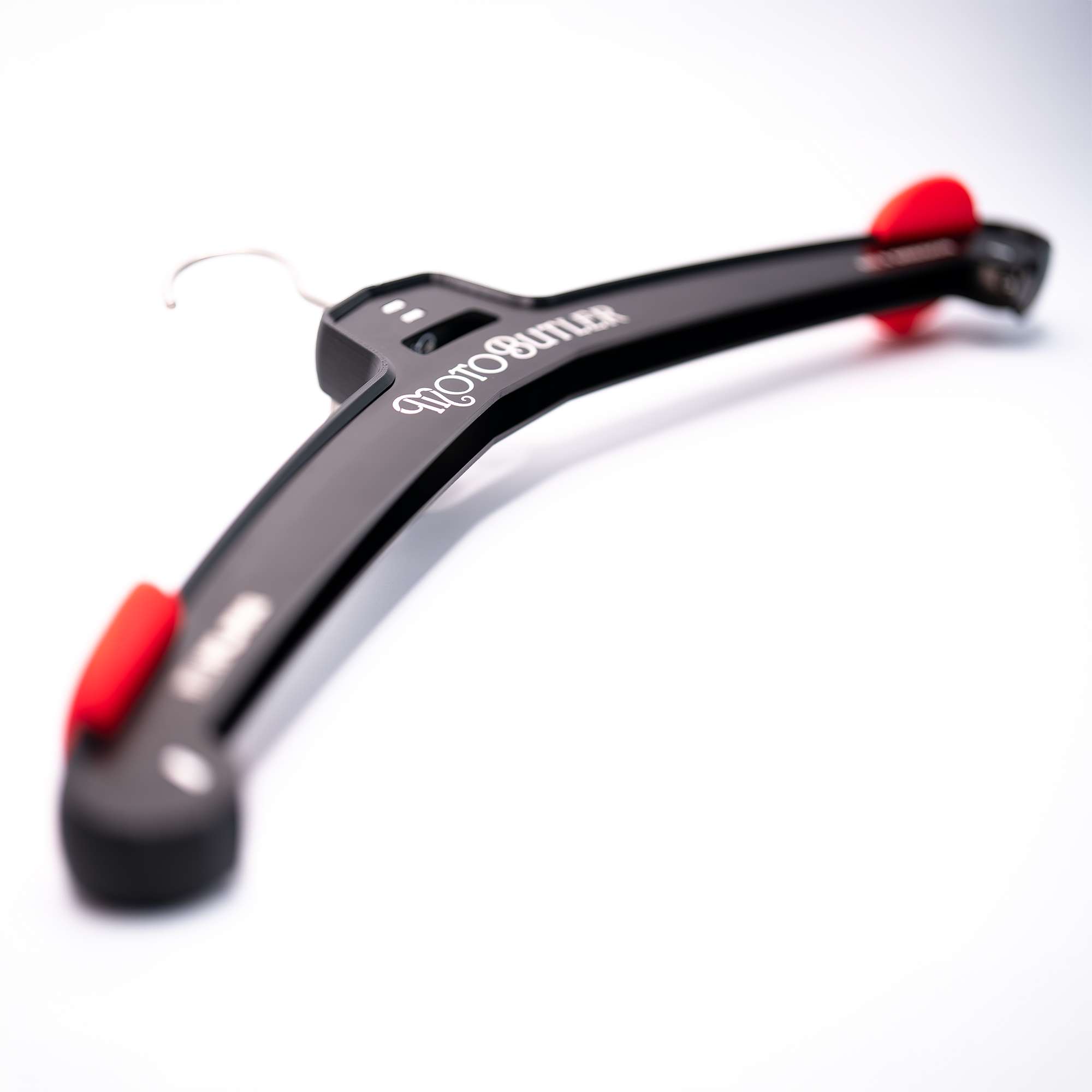
MotoButler is a new company manufacturing heavy-duty storage solutions for motorcycle clothing and helmets. The initial product is a burly aluminum hanger and helmet rack, with future products under development. The brand is fun and cheeky which makes it fairly distinct in the world of motorsports brands, and creates strong brand memorability for a genre of product that is typically extremely utilitarian.

A unique take on a utilitarian product
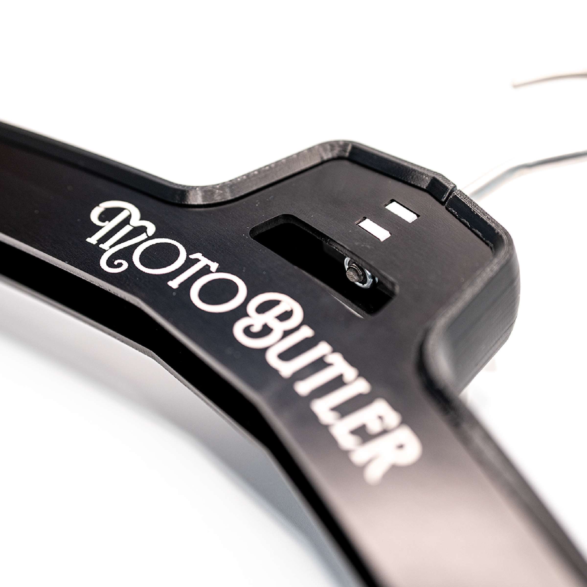
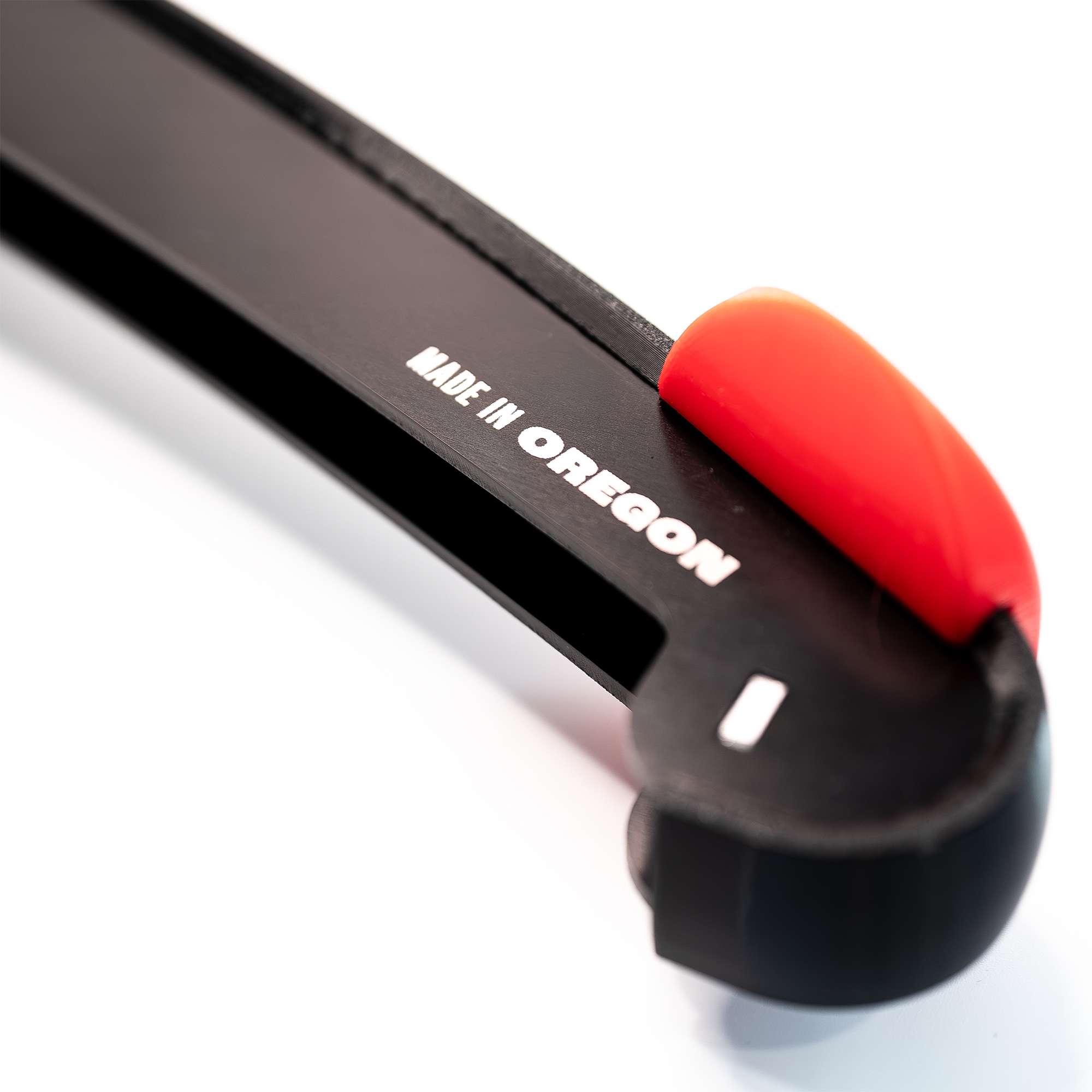
MotoButler is a startup company that is fabricating burly storage solutions for burly equipment. The initial product lineup consists of an aluminum clothes hanger designed specifically for heavy motorcycle leathers, and a motorcycle helmet holder. Additional products and industry applications are also in the pipeline. The founder of MotoButler has a background in high-end metal fabrication and the products are 100% designed and manufactured in Oregon. The quality of the products are extremely high—but just getting potential customers to look at a $100 clothes hanger presents a unique branding & marketing challenge.

Creative client & freedom to roam
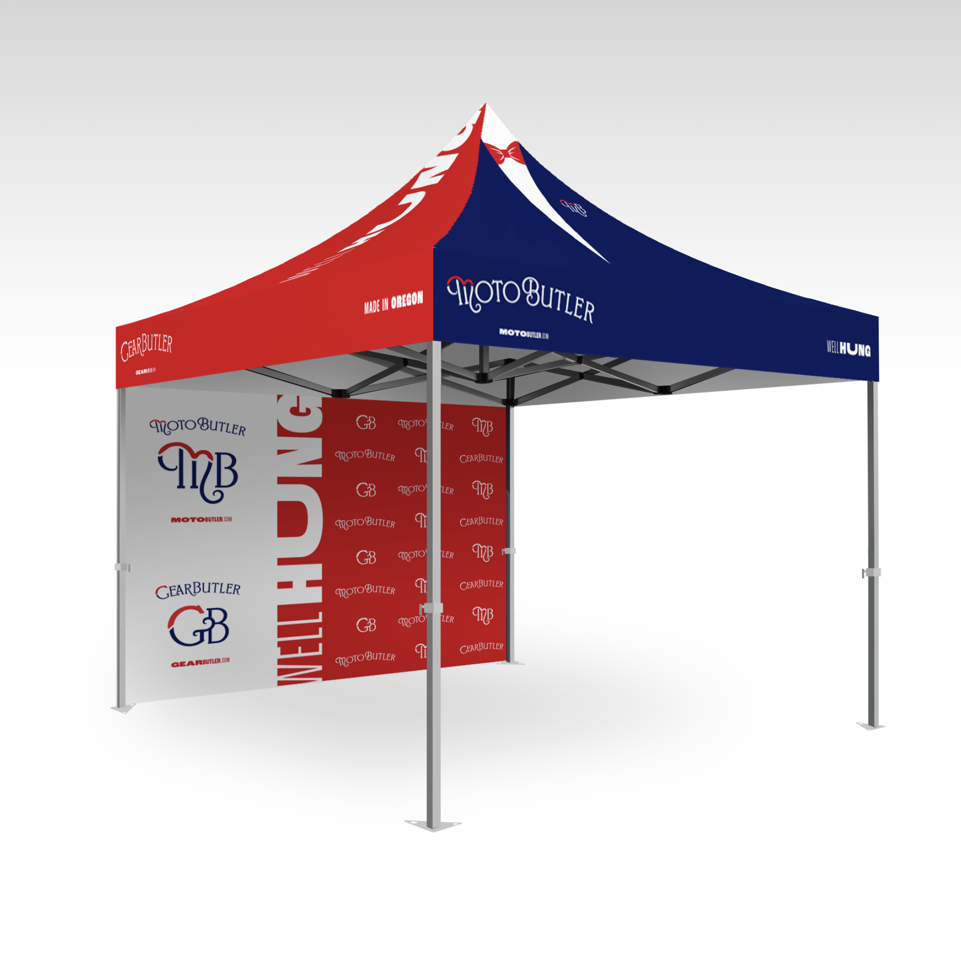
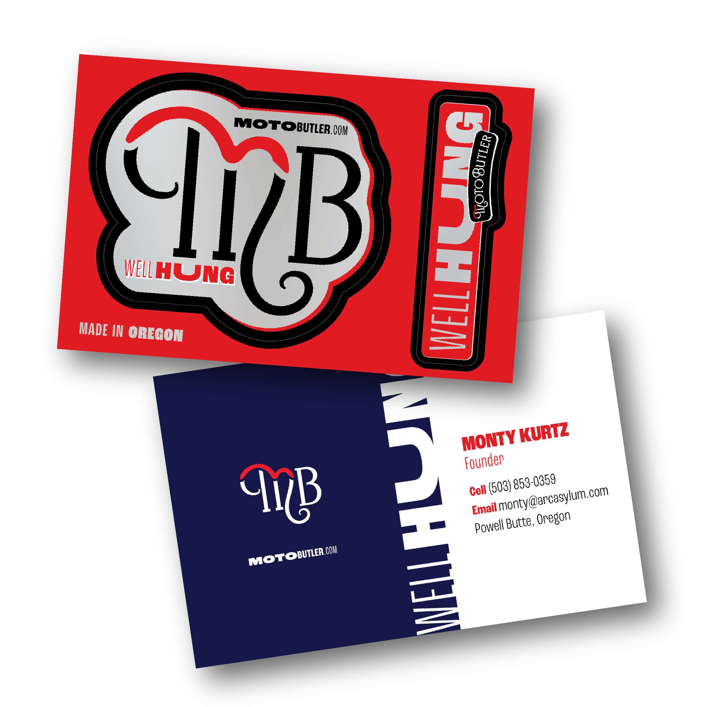
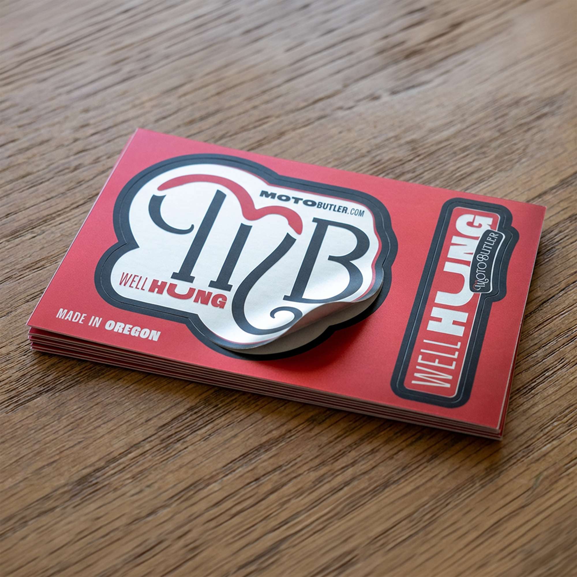
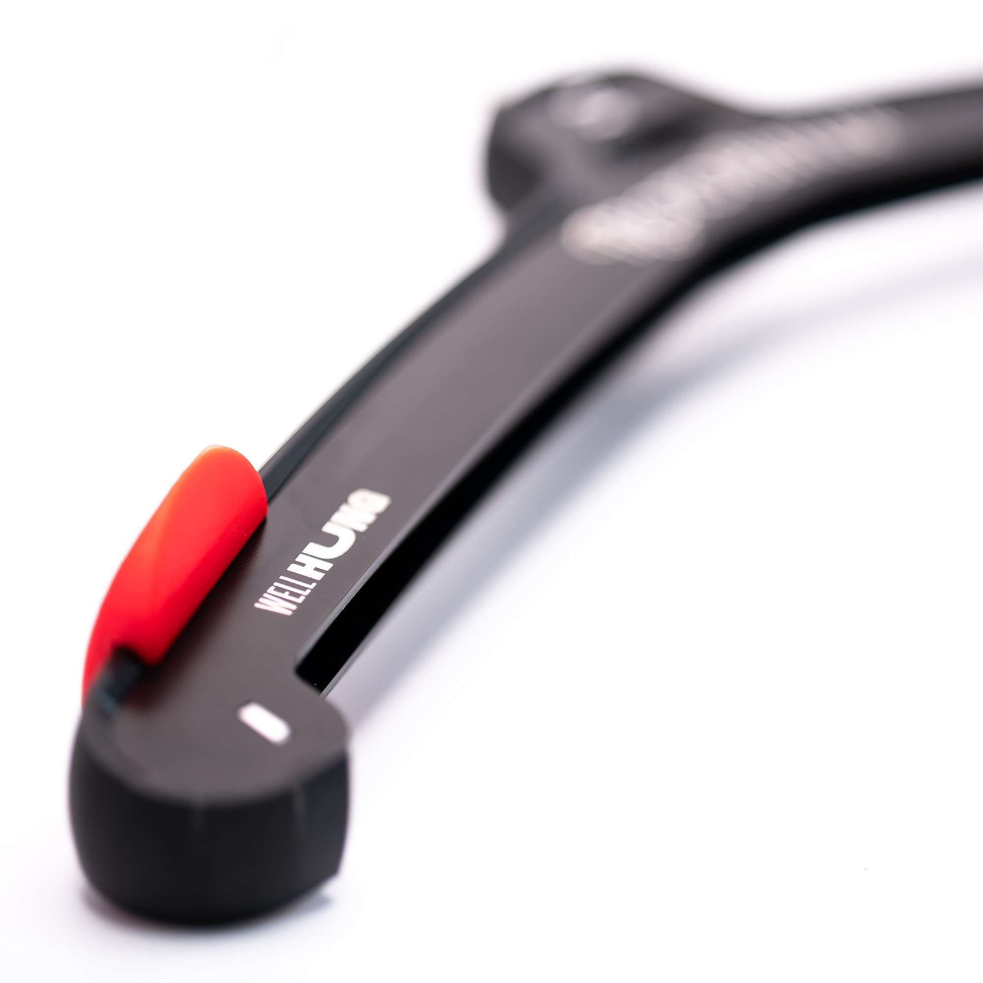
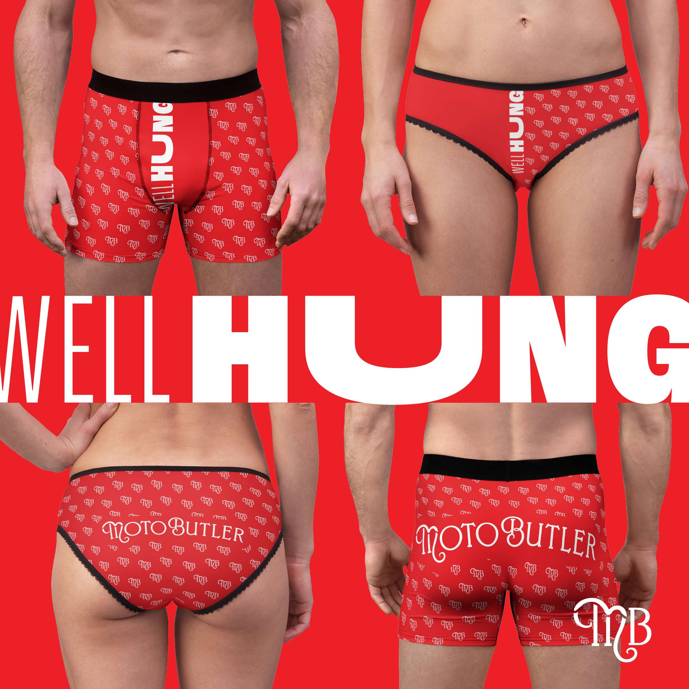
When MotoButler first came to me they were looking for primarily an illustrated character. While the owner has been a long time entrepreneur, branding, and all that it entailed was not something he had really engaged in much previously, though he was very open to ideas. He also came with an intrinsic sense of brand voice for MotoButler—humorous, light hearted, and visually unique from other motorsports branding. For example, his initial logo was a script font to play off the Butler name; the tagline WELL HUNG was an element he wanted to focus on, and the bold color palette mimics the product colors and plays well when used as sticker or decals on motorsports products like bikes and helmets. So with some solid concepts already in place I was able to take those ideas and refine them into a brand that was visually unique and cohesive. The basic typeface for the logo was changed from a default system script to a more unique option, and then modified further for the MotoButler logo. The WellHung, Made In Oregon, and Motobutler.com elements were standardized with a variable sans serif typeface that is cheeky and a perfect contemporary balance to the ornate MotoButler logos. Color values were specified to ensure consistency across brand elements.

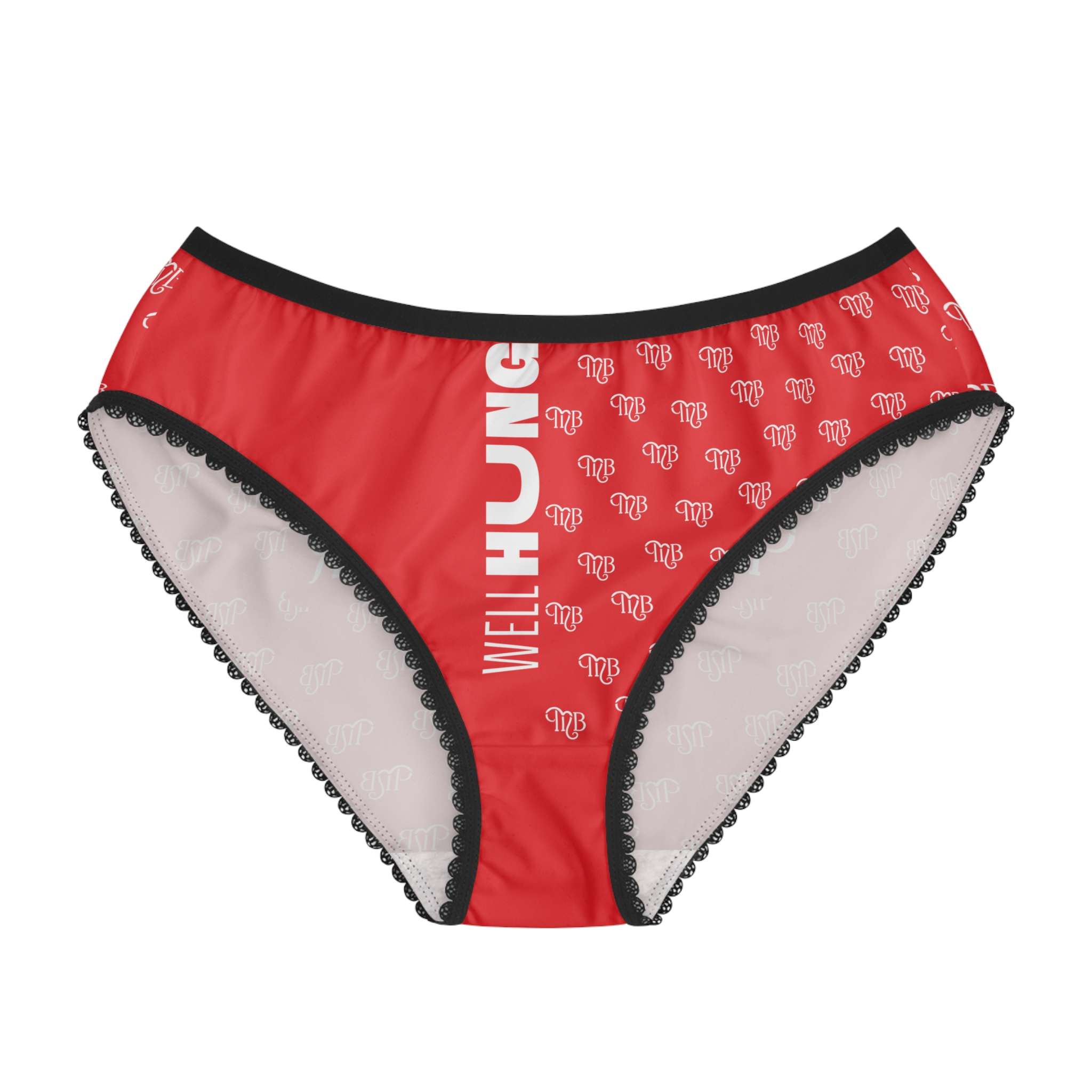
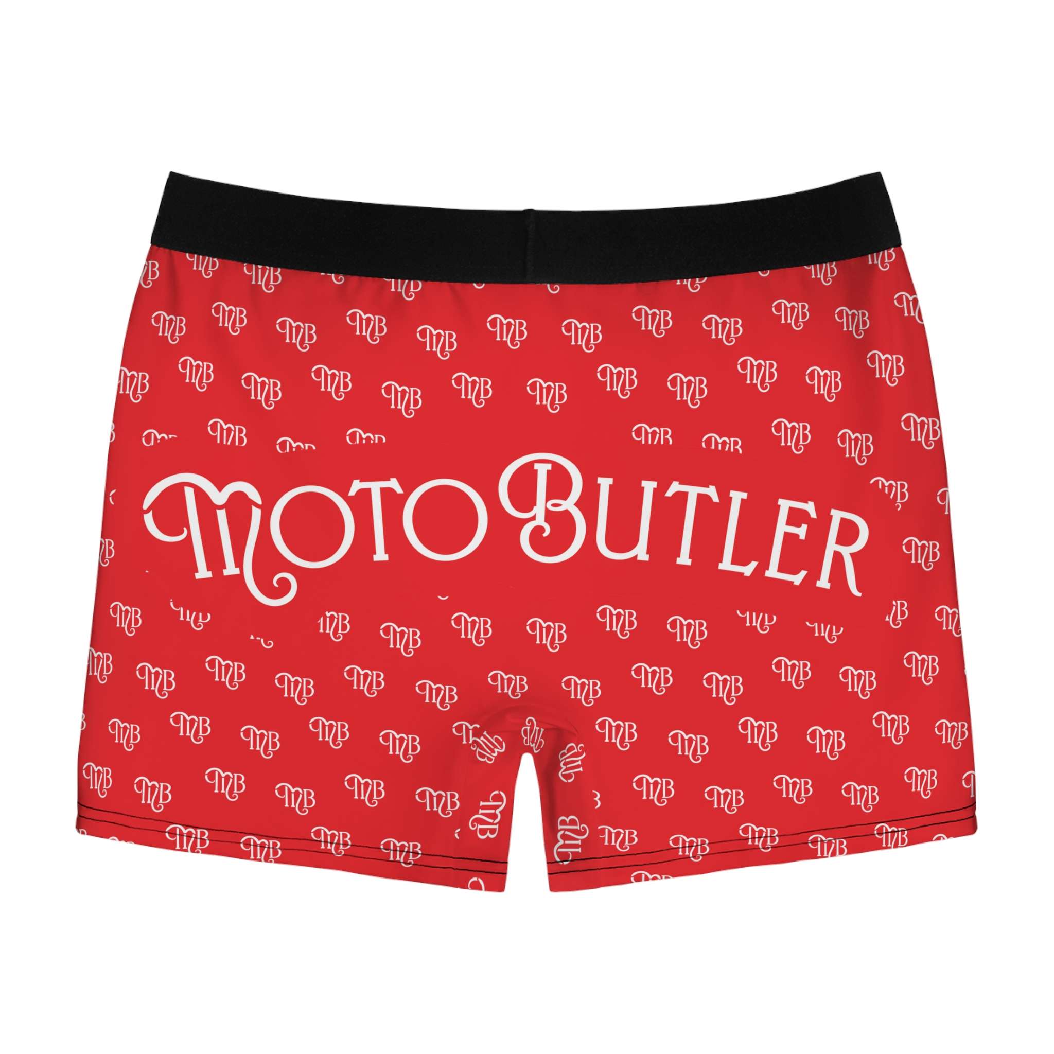
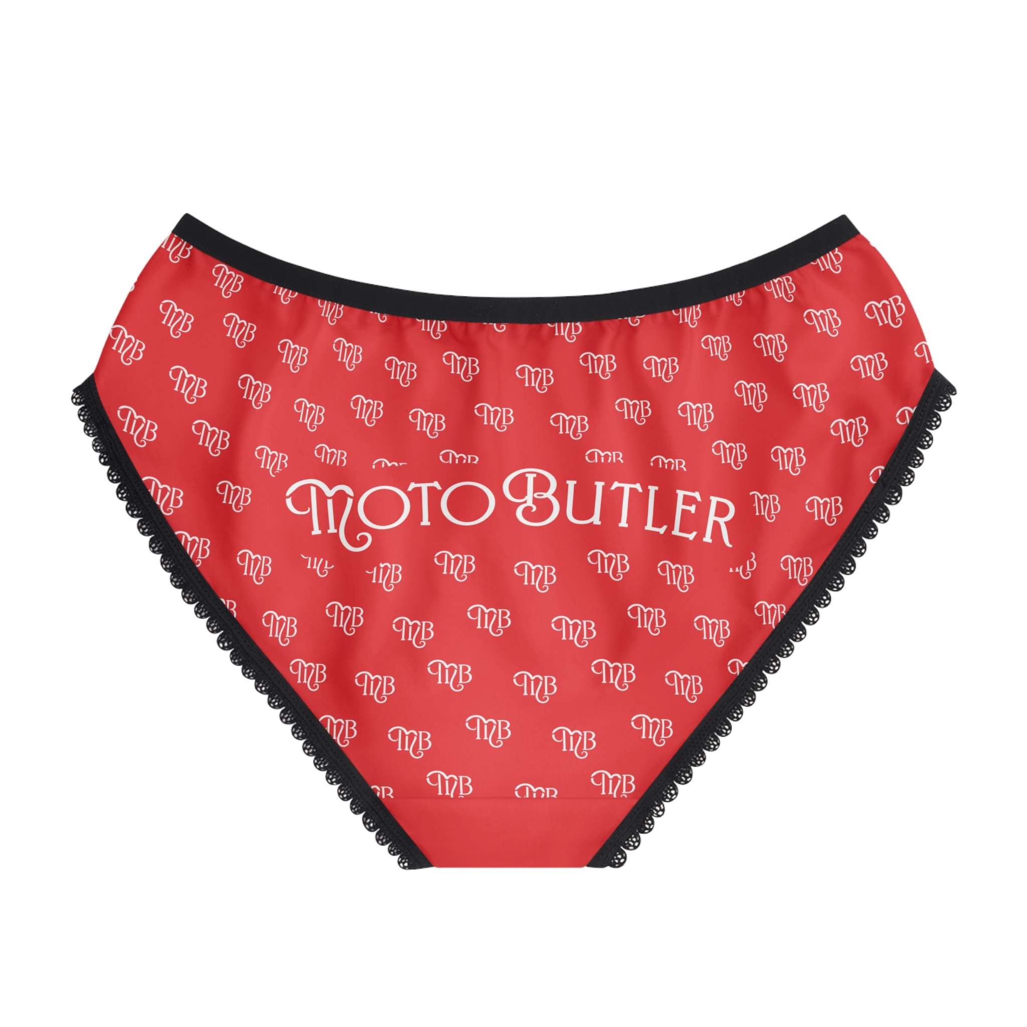
Grab attention, explain later
This is a small upstart, with customers growing organically through word of mouth, sporting events, trade shows, etc. Grabbing attention is enormously important. This product won't be for everyone, but just getting the right people to pick it up will be what is needed for success. The branding and marketing will be key to making that happen and humor is great tool to achieve that. Once the product is in the right person's hands, the value will become self evident.


A brand made to grow
While the initial product launch is targeted primarily at the motorcycle industry, there are applications for these products across many industries, both industrial and recreational. The logo characteristics allow for new iterations that are still clearly part of the same brand umbrella, such as GearButler which would act to serve a broader range of audiences outside the motorsports industry, while still having a clear visual connection to MotoButler.