MENU
Tikka Masala
Tikka and Tikka Masala are two interconnected branded Indian restaurants in Washington D.C. Tikka is a sit-down fine-dining experience while Tikka Masala is a carry-out experience based on Indian street food. Both menus are created by the same chef and give customers a different take on Indian cuisine.

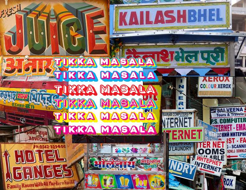
Two experiences, two connected brands, inspired by the abundunt variety of indian cuisine and colorful street art.
This brand identity posed an interesting challenge - two restaurants which exist under one umbrella and share a culinary philosophy, but provide two very different dining experiences. The brand needed to represent each accurately while also connecting them for the consumer.
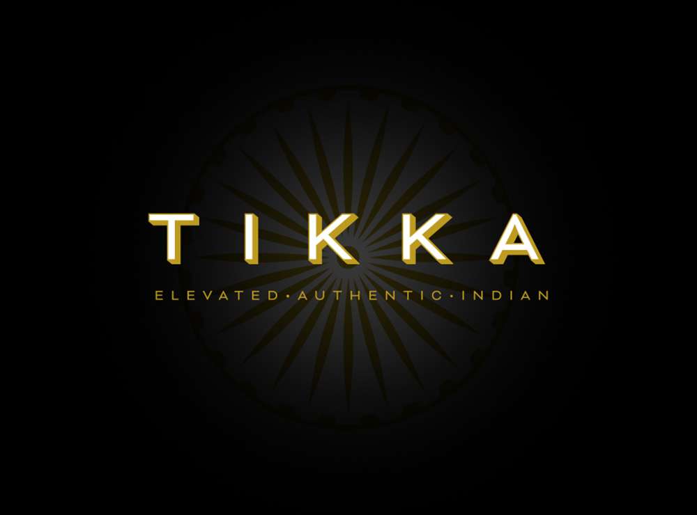
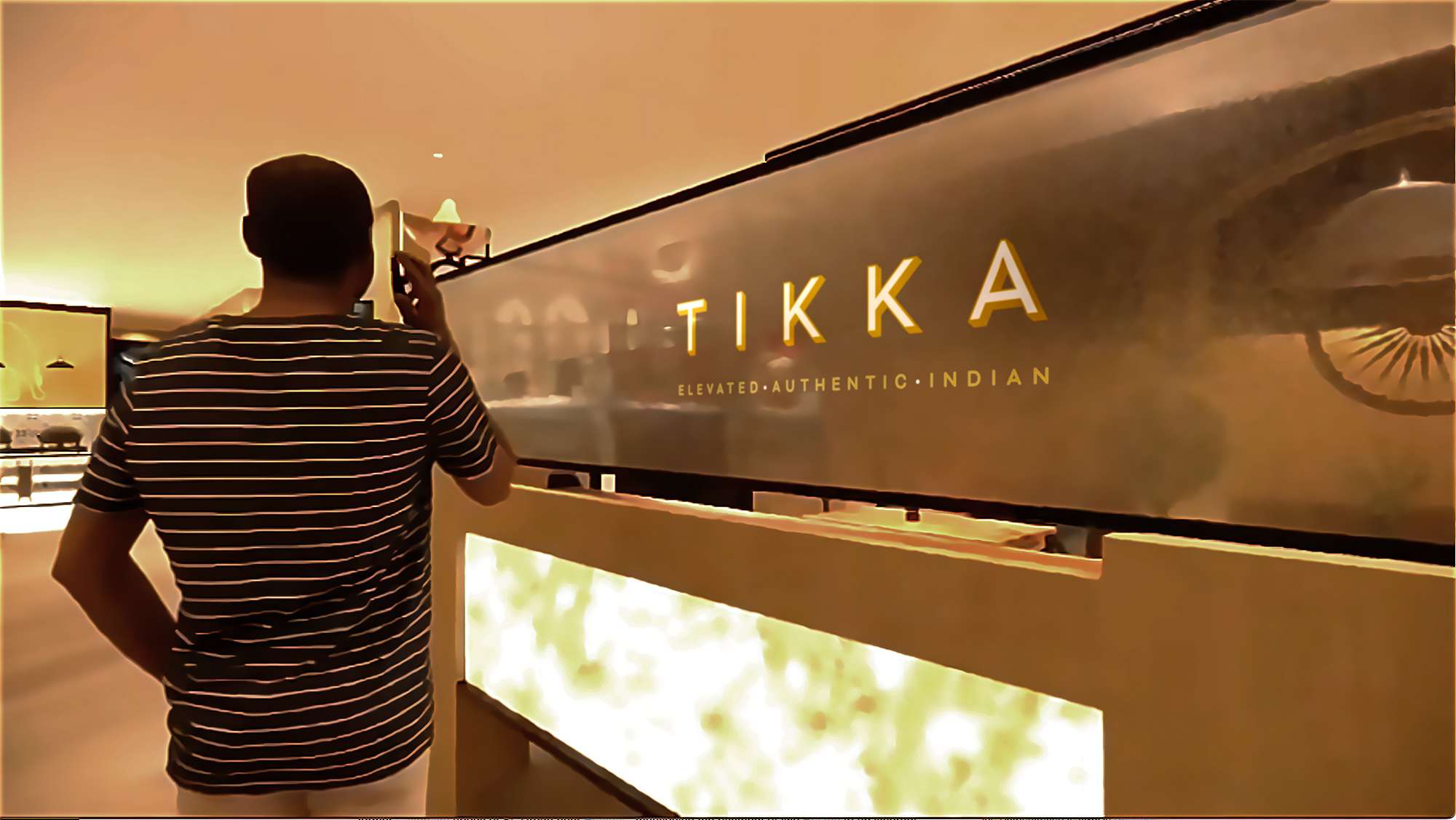
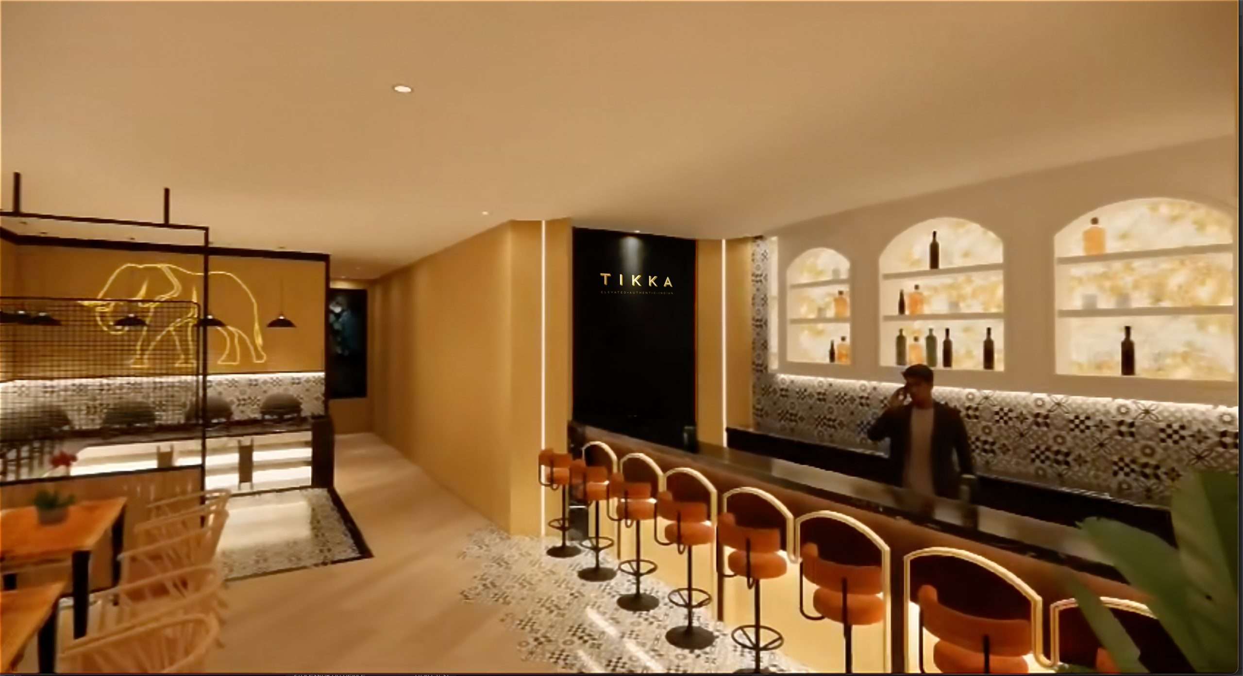
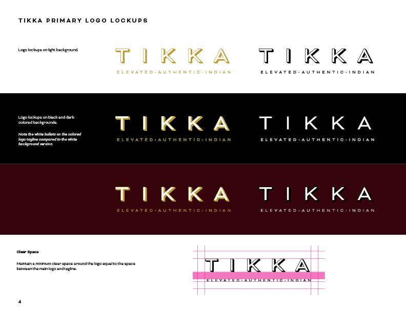
The Tikka restaurant is a sit-down, upscale, dining experience and the subdued branding and darker hues reflects that atmosphere.
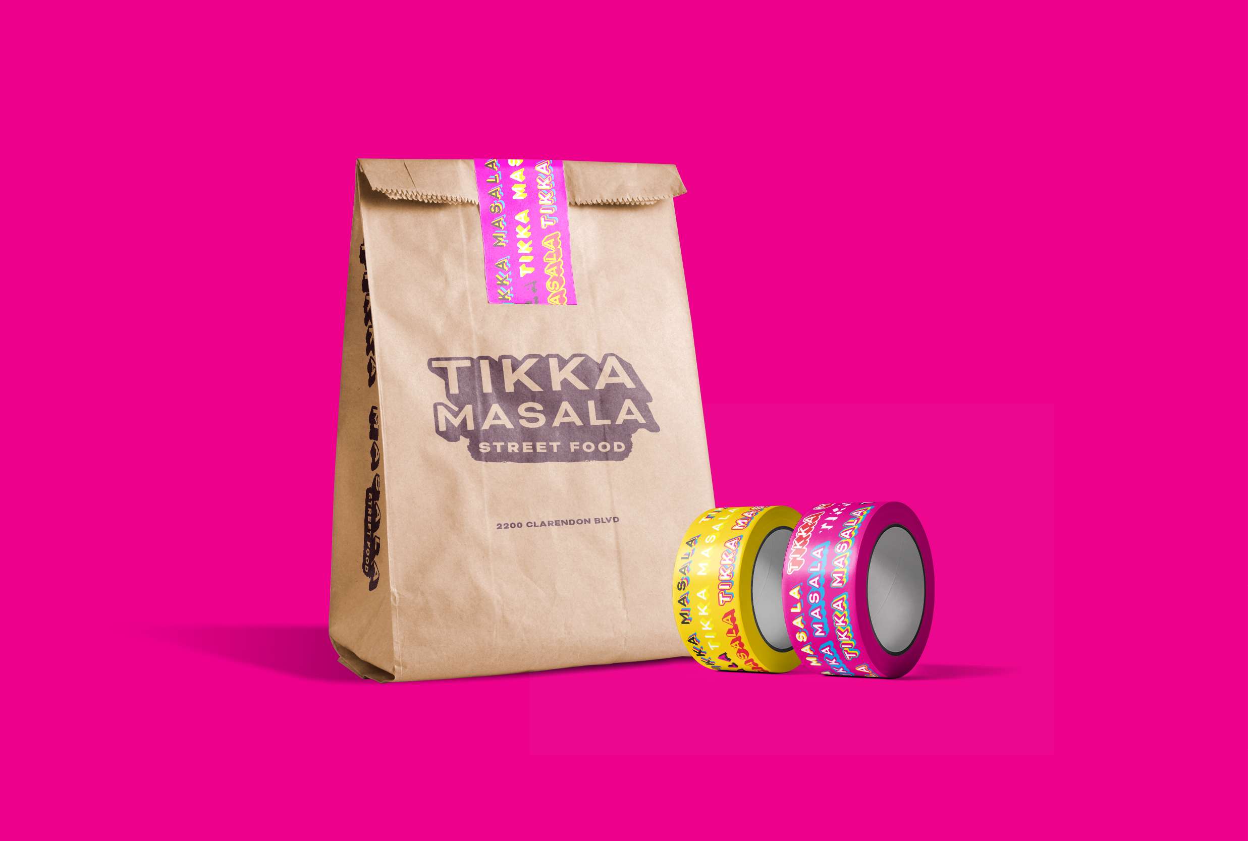
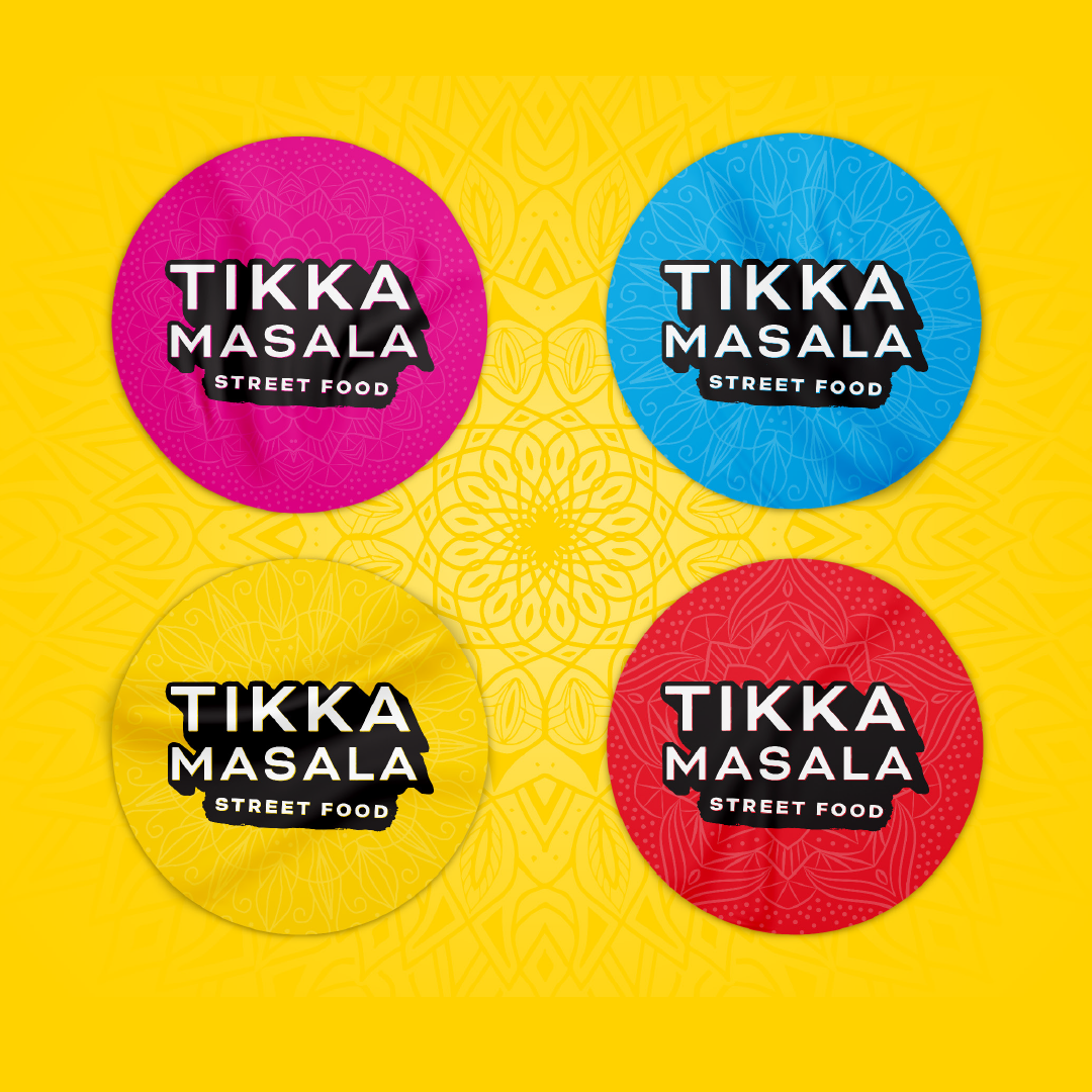
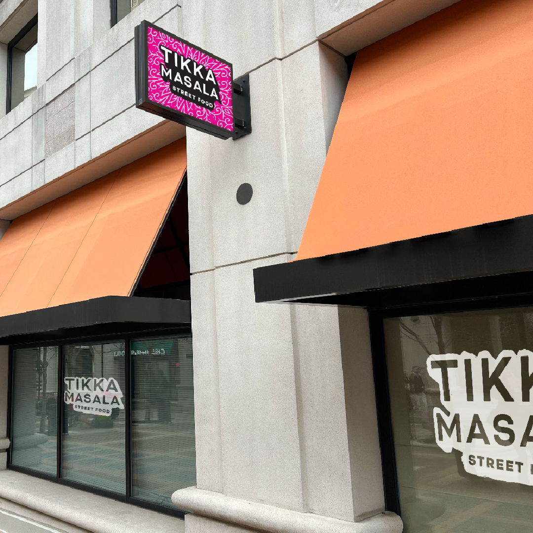
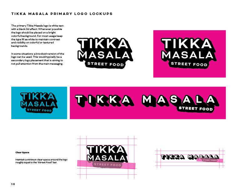
Tikka Masala Street Food on the other hand is a casual walk-up restaurant that brings the flavor of Tikka to customers in a casual lunch-time and dine-at-home experience. The logo is bright, energetic and colorful. The brand is a contemporary take on Indian street signage.
While each restaurant’s branding needed to accurately represent what the customer will be getting, it was also important to create a visual thread of connection between the two restaurants to build brand recognition and growth across both restaurants simultaneously.
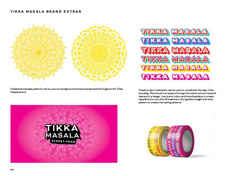
Tikka and Tikka Masala brands are visually connected through the use of font, type treatment, and the usage of brand ornaments. We distinguish the two brands primarily through color, font weight, and imagery. The two brands balance the needs for unique representation and cross-brand recognizability.