MENU
Prineville Paddy Pint
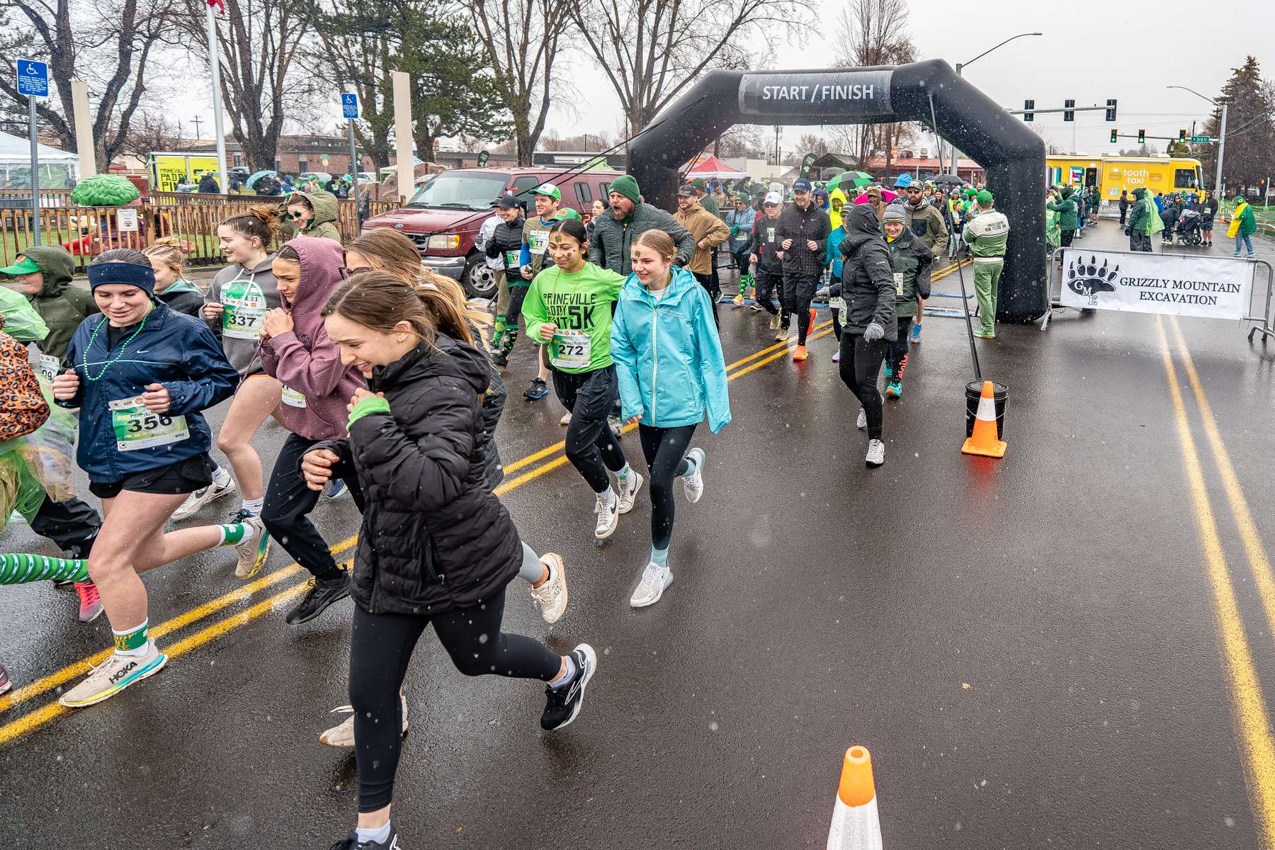
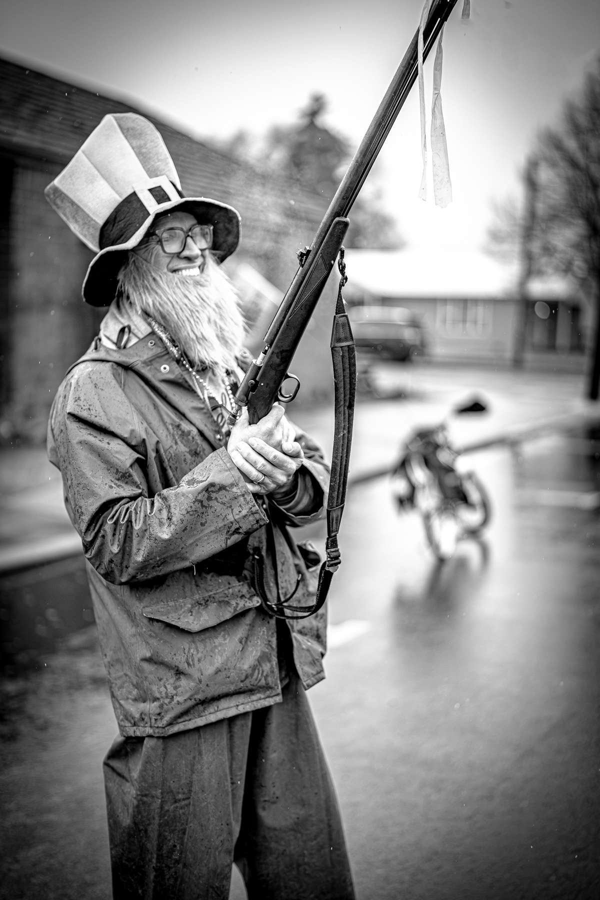
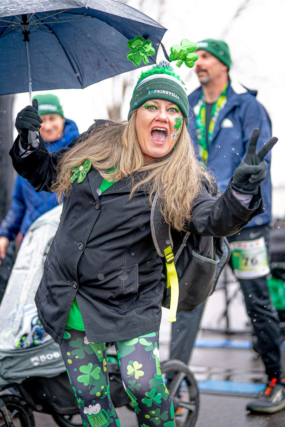
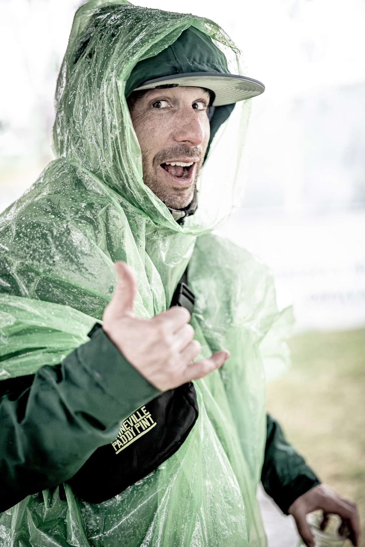
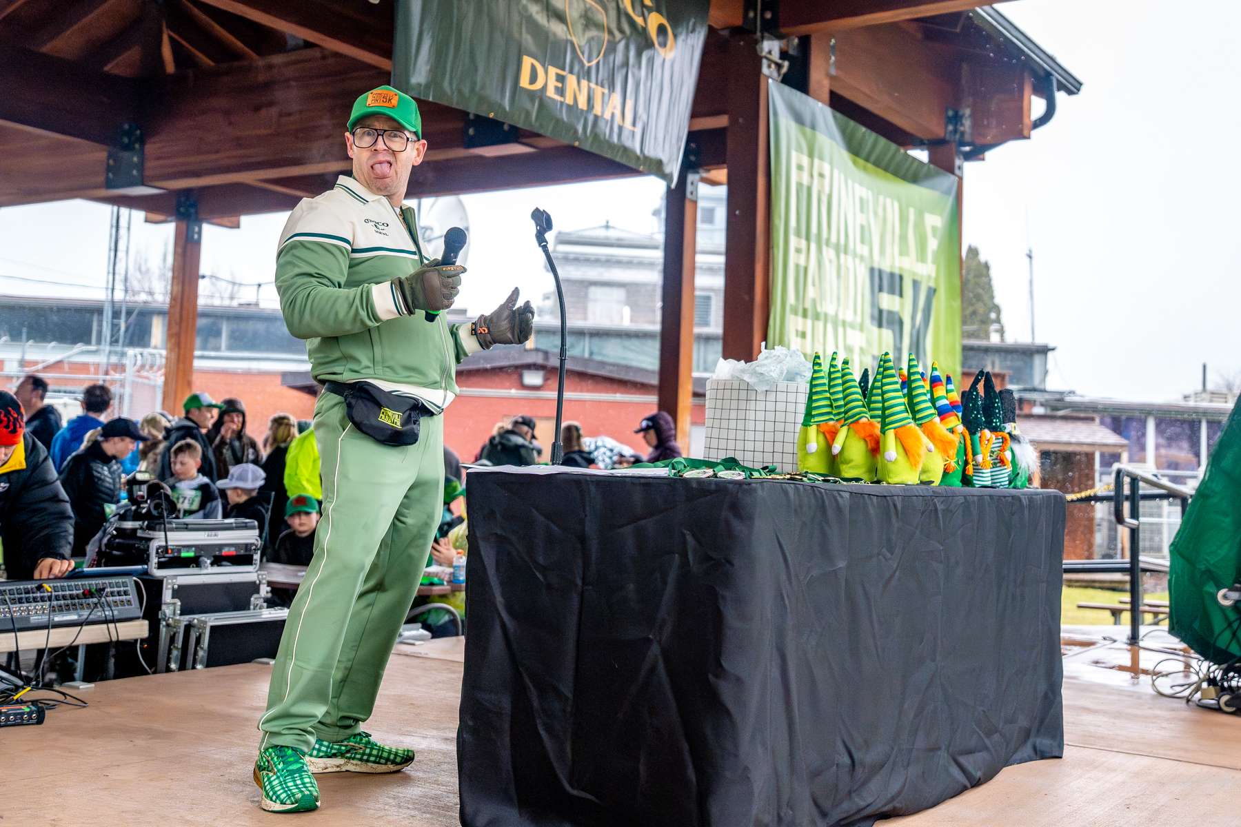
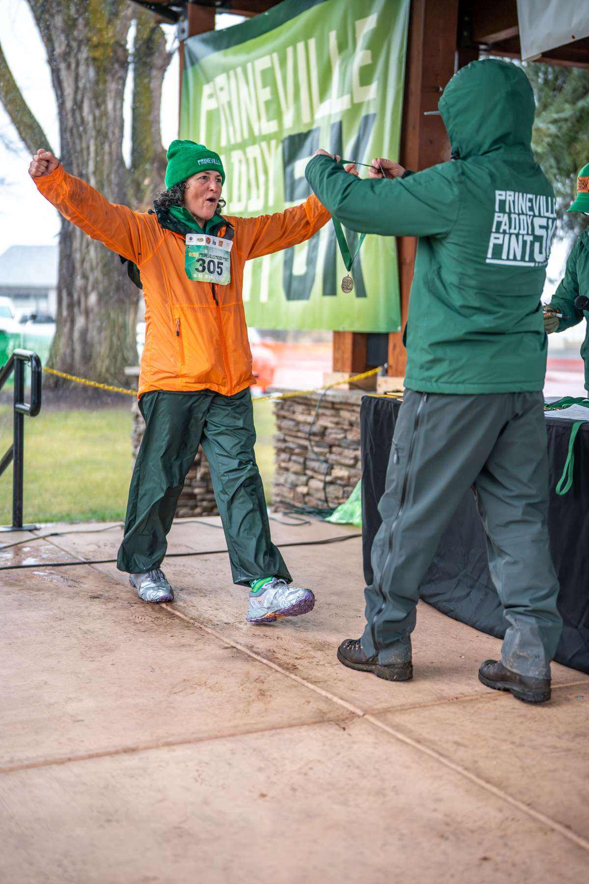
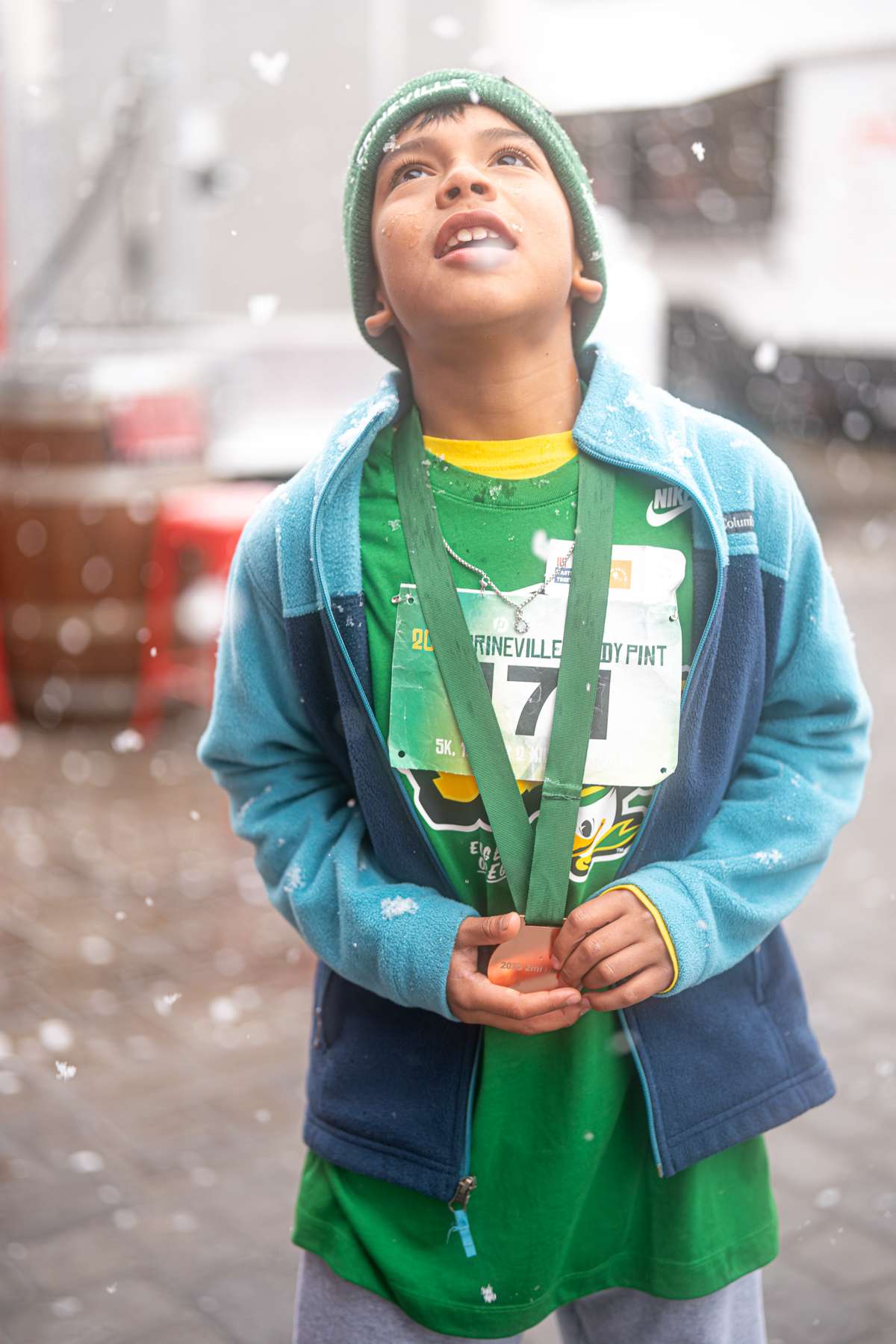
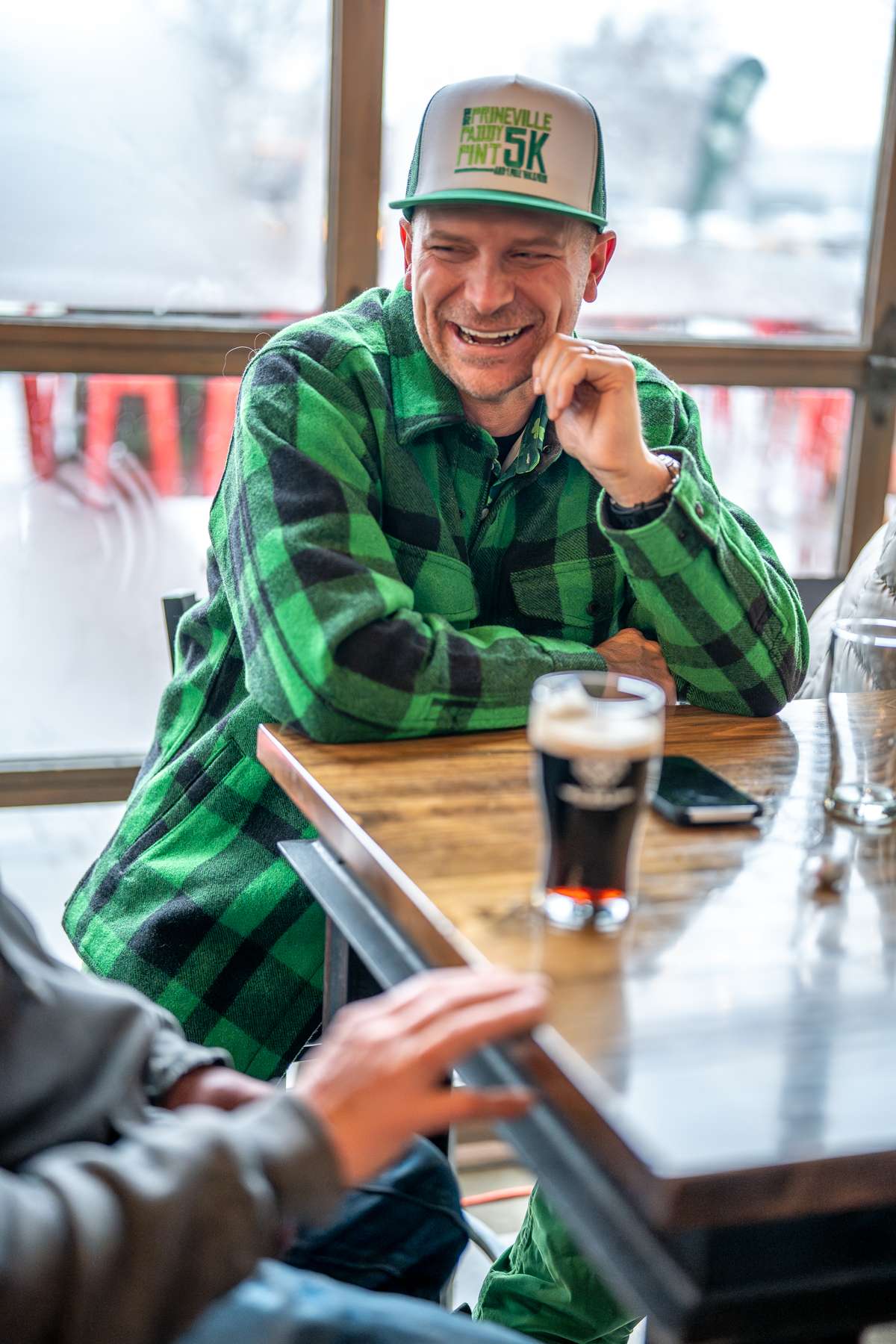
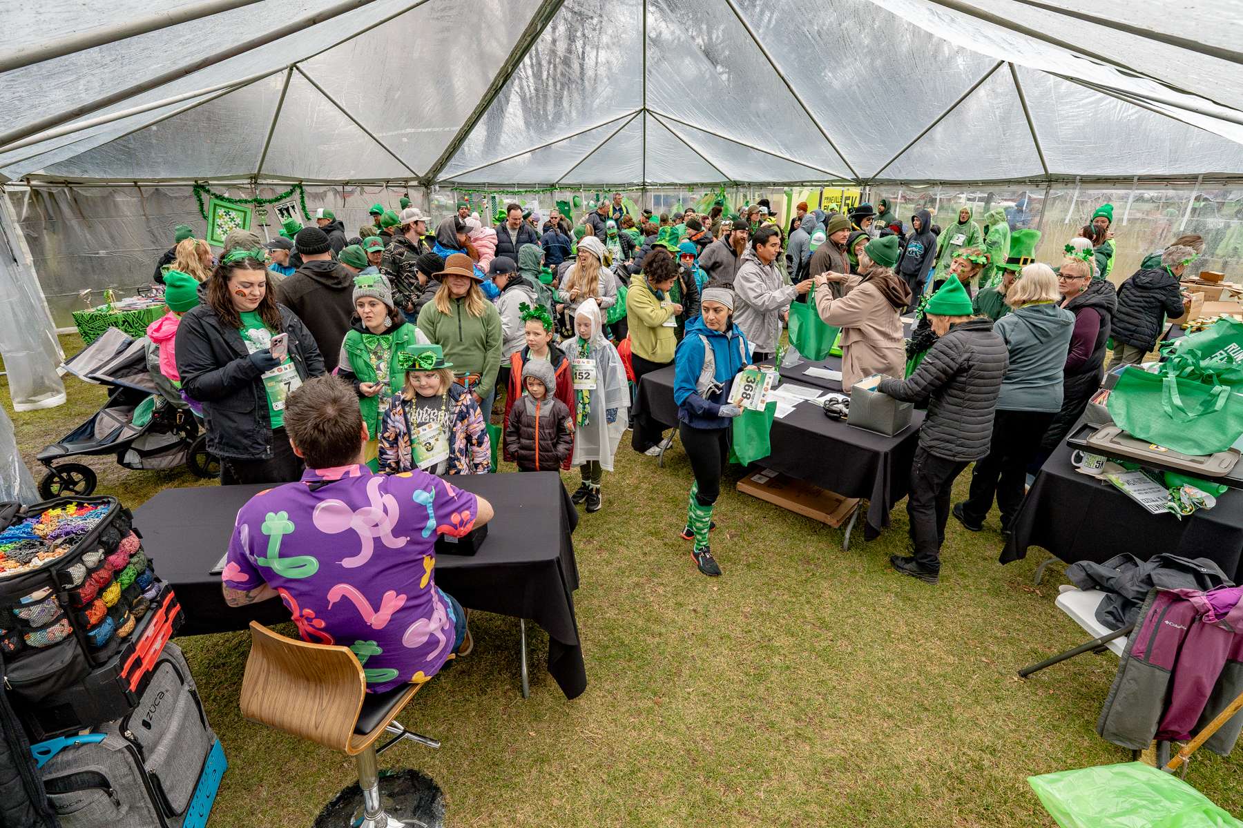
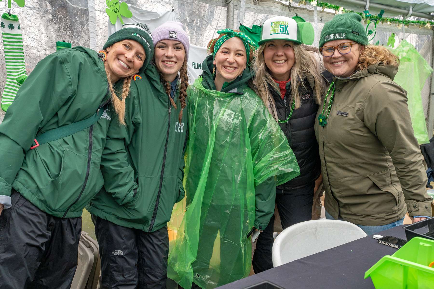
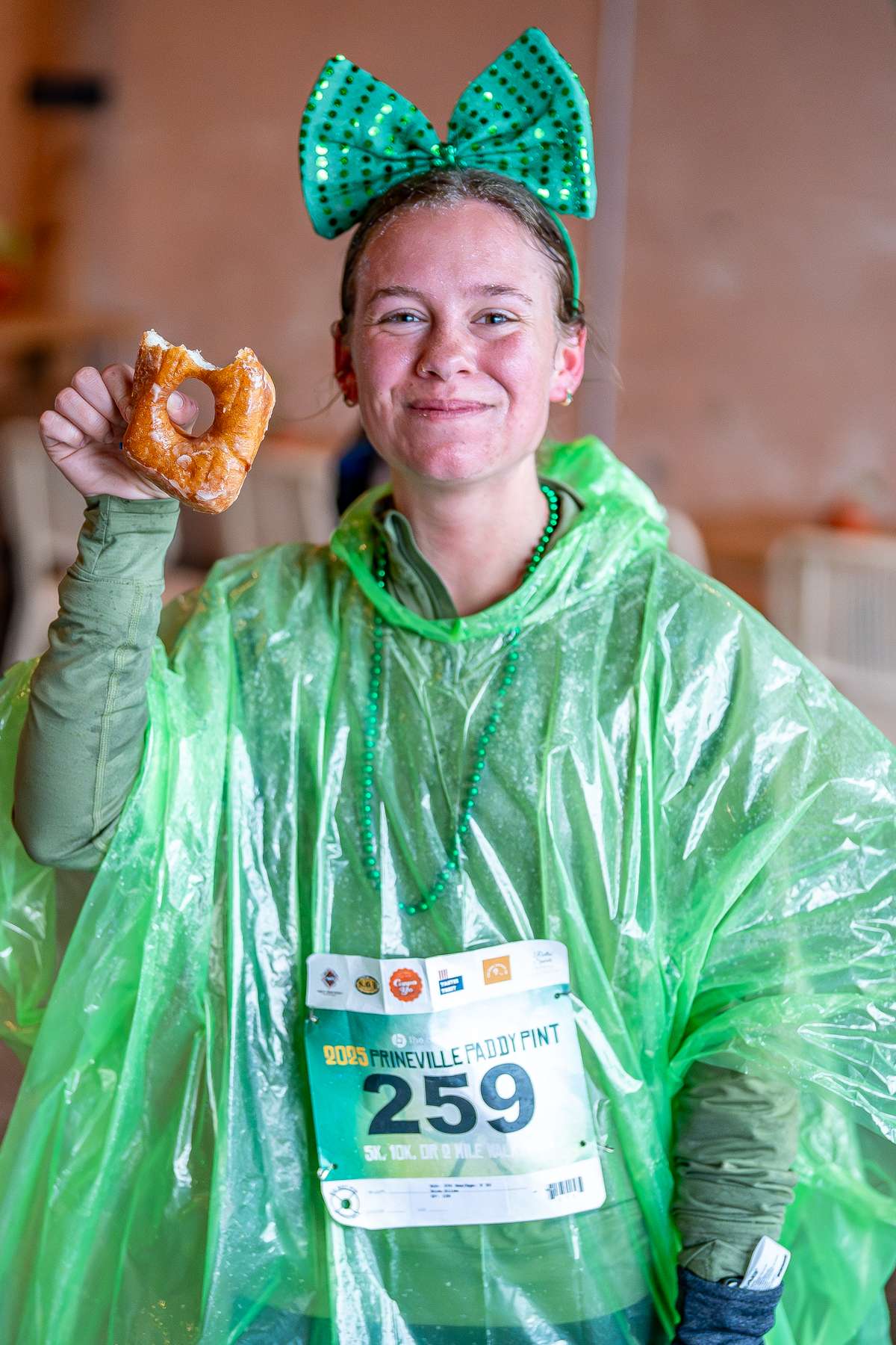
Brand identity, collateral, photography, and web design and development for the Prineville Paddy Pint. This event has grown enormously since its inception in 2013, from just a couple dozen people to now hosting over 600 runners and walkers!
A ten year brand identity project
The Prineville Paddy Pint brand is a unique case of a brand that has been developed organically over many years, with minimal strategic or conceptual planning. Needless to say this is not generally a great way to build a quality brand. And yet, the Paddy Pint brand has evolved into a cohesive, professional, bold, and recognizable identity.
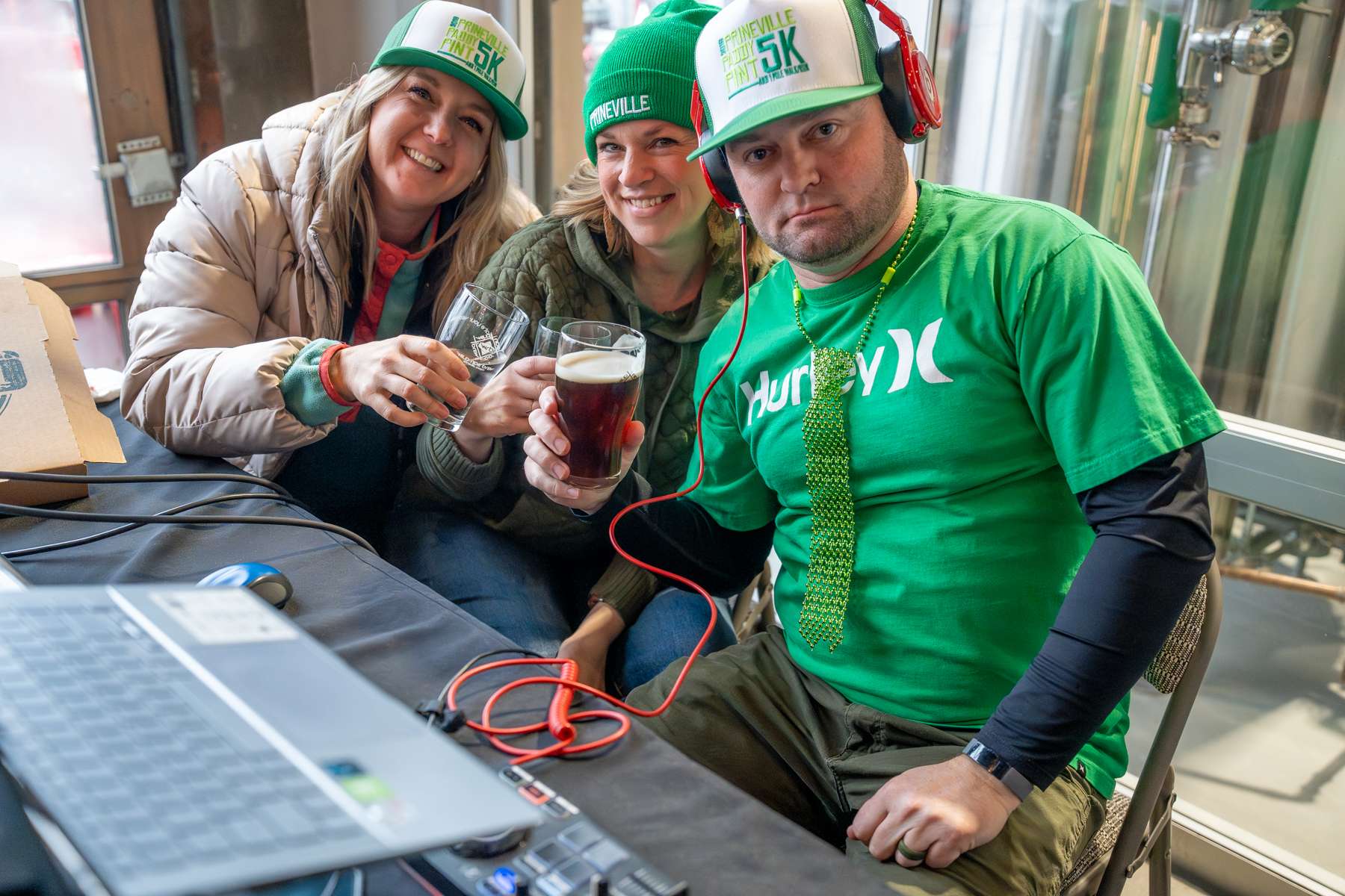
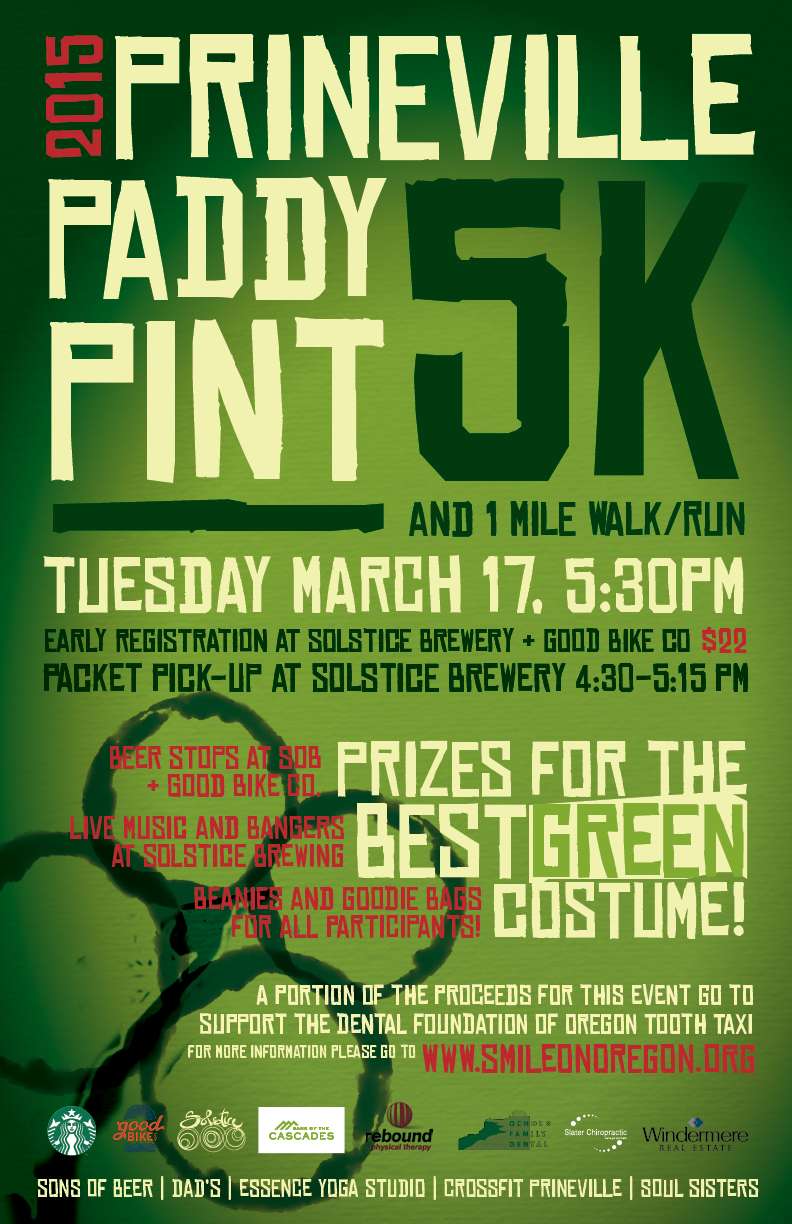
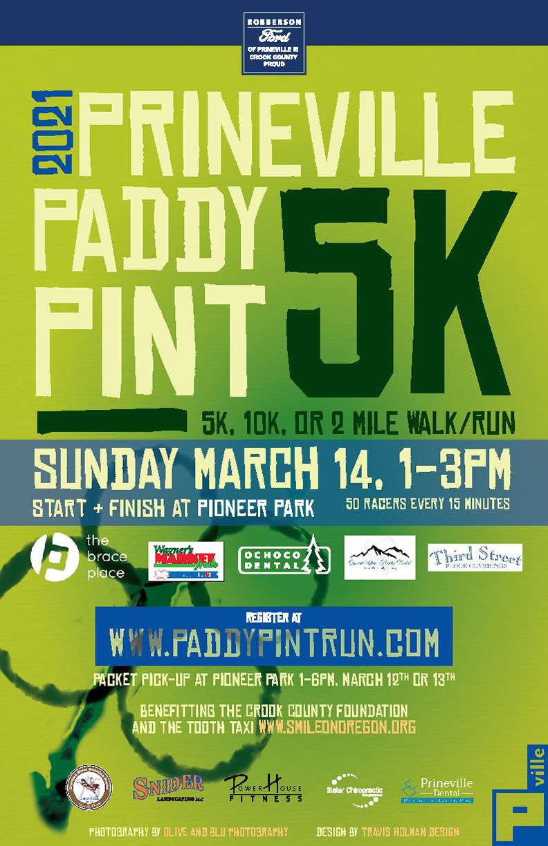
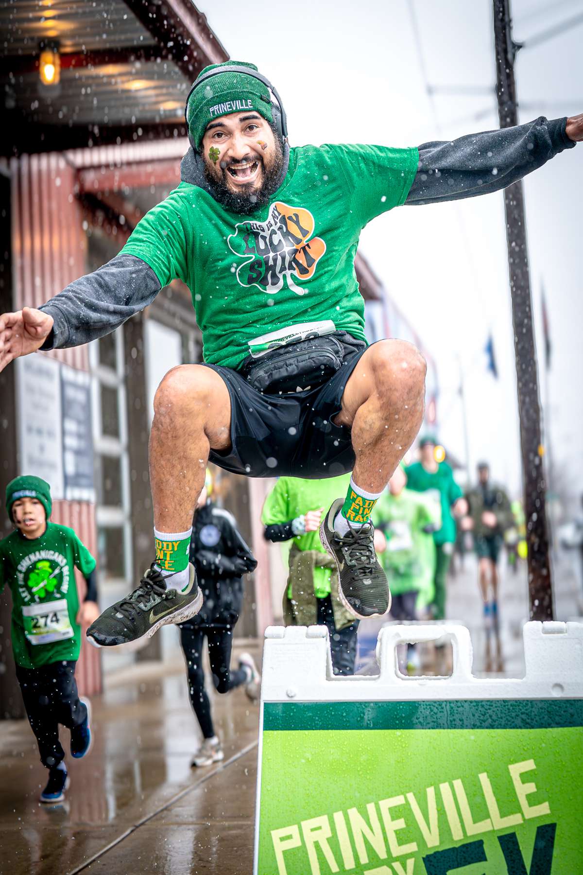
The inaugural event was in 2013 as a small grassroots race, little to no marketing and a couple dozen participants. For 2014 the organizers decided they wanted to try and increase participation and I offered to design a poster they could put up around town. The initial poster was only intended to be just that—a poster. There was no expectation that the poster would be the basis for the branding of an event that has become a Central Oregon tradition. An event which now sees upwards of 600+ participants and multiple days of activities every March.


Brand Implementation > Slick Logo
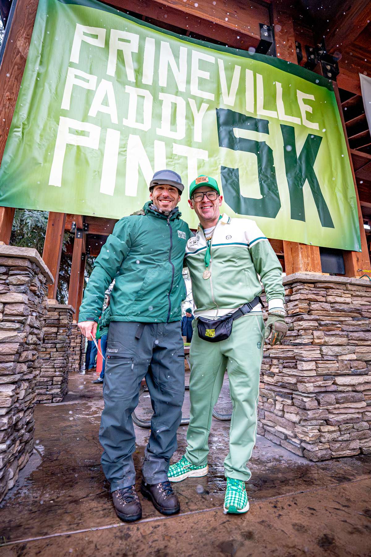
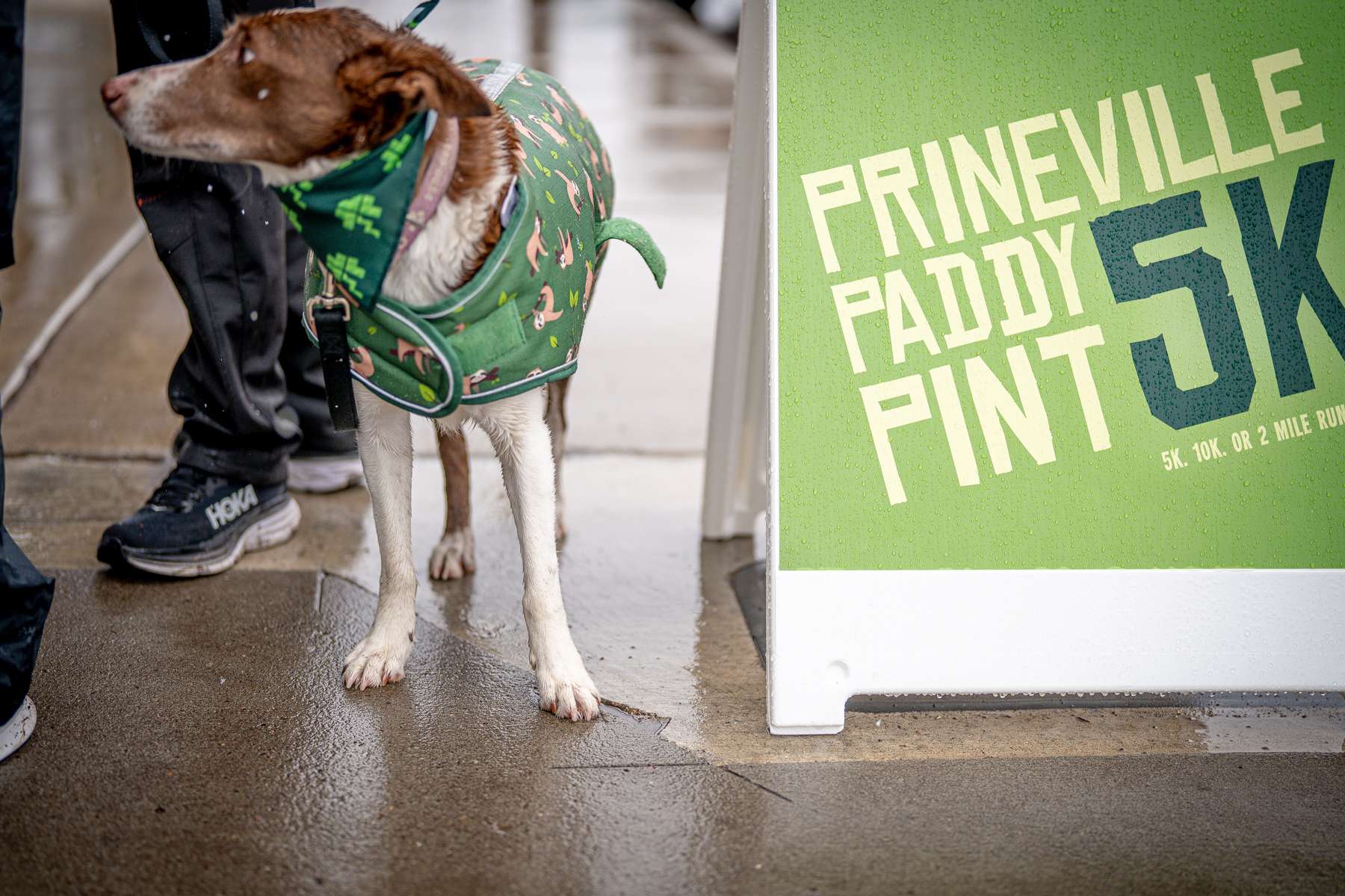
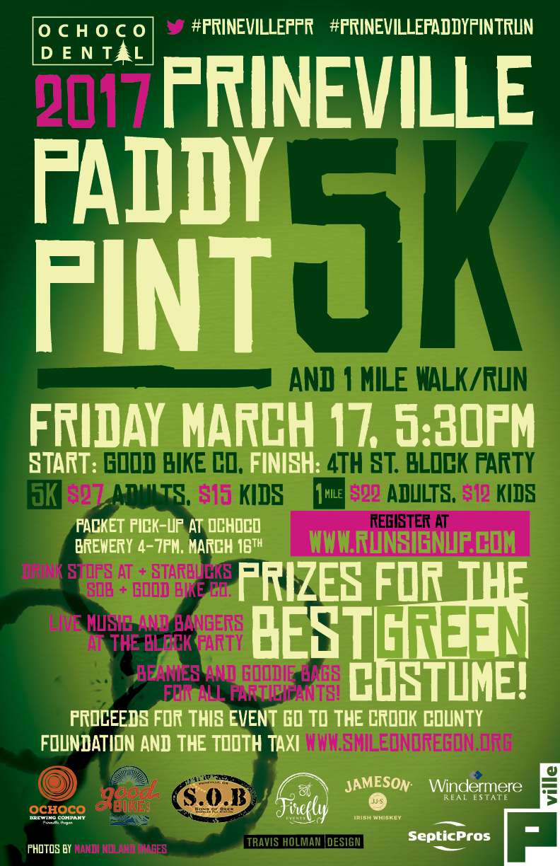
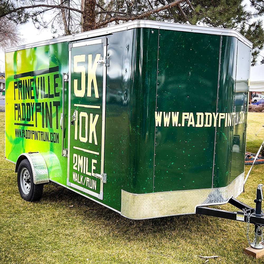
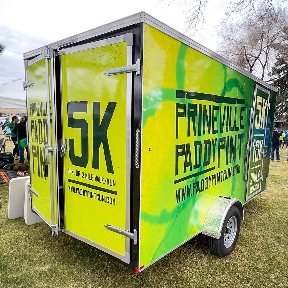
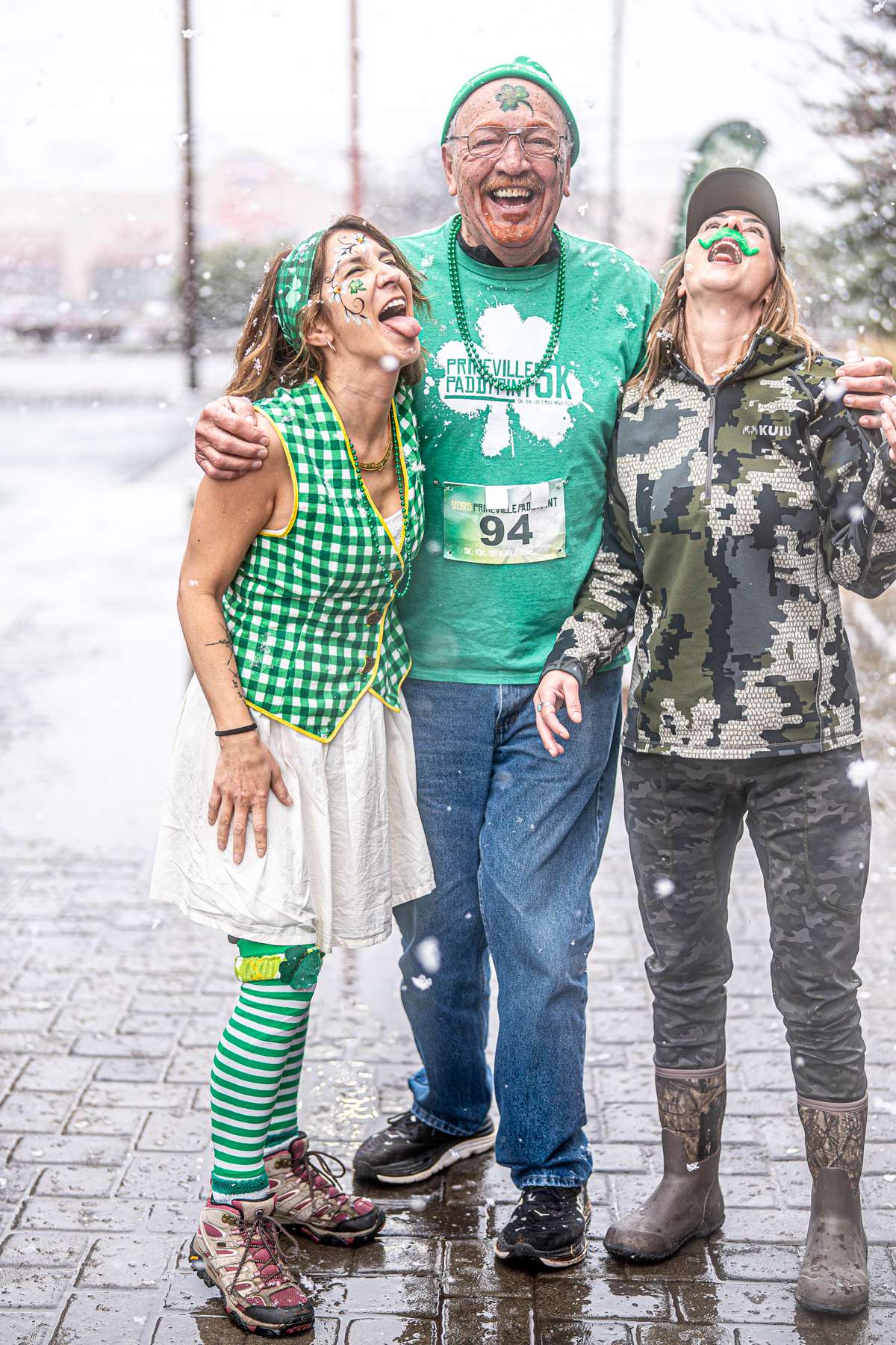
A brand's logo is certainly important, but it is only one piece of a successful identity. The Prineville Paddy Pint logo is a simple wordmark, set in the cartoonish font "Chinese Rocks". I don't think there's a self-respecting designer anywhere that would use Chinese Rocks as a primary brand typeface. That certainly wasn't my intention on that first poster. But as the event grew steadily each year, so did the brand identity. The poster design was largely unchanged each year, and as marketing for the event began to include additional media like clothing, signage, vehicle wraps, race swag, etc., it made sense for the sake of brand consistency to adapt the poster design to all these items. So what began as simple one-off poster evolved into a strong brand identity that is easily recognized throughout Central Oregon.
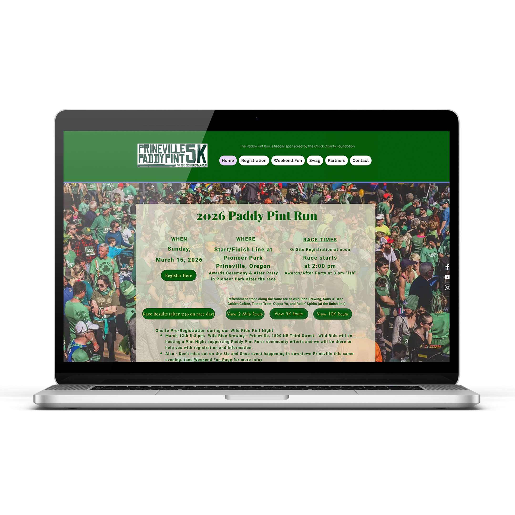
Old SIte
New SIte
Website Design/Build
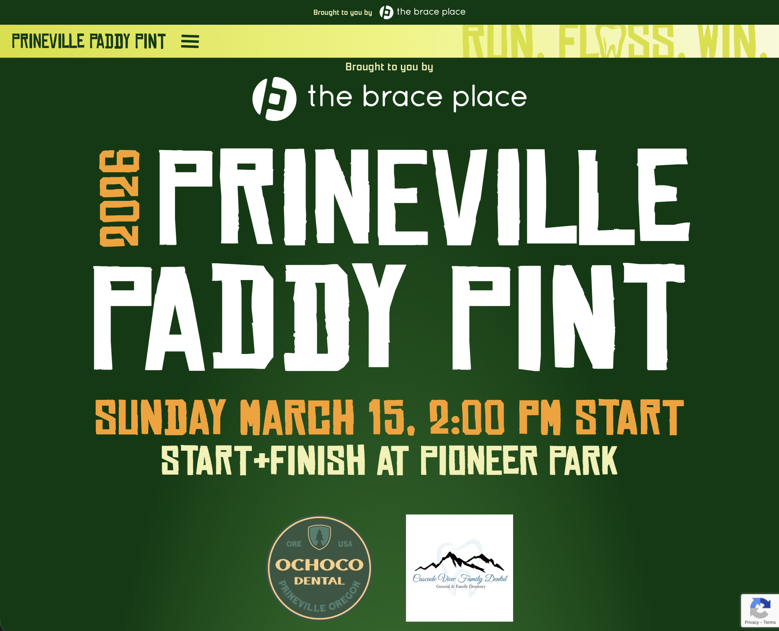
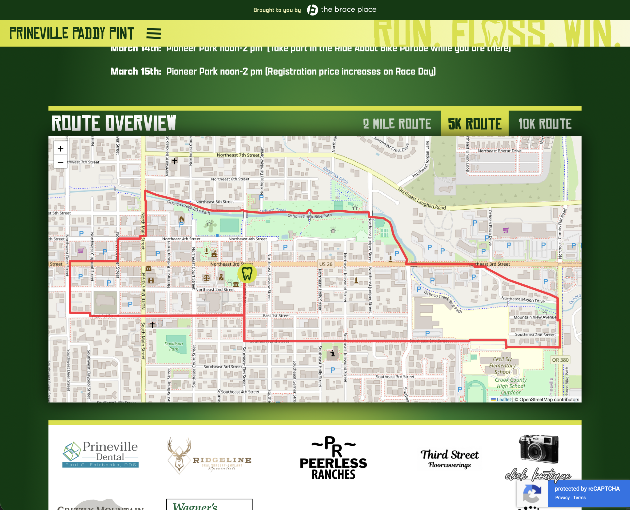
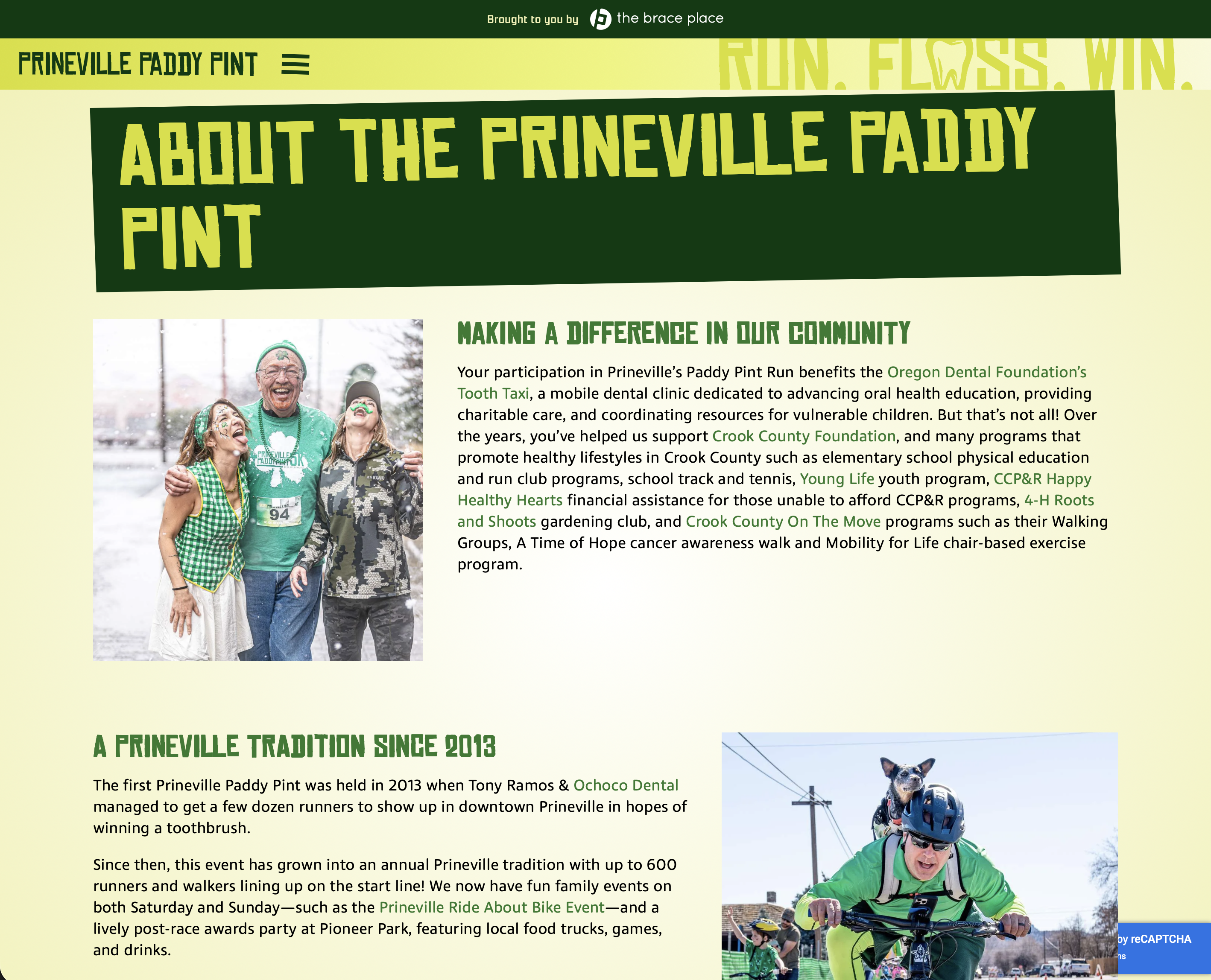
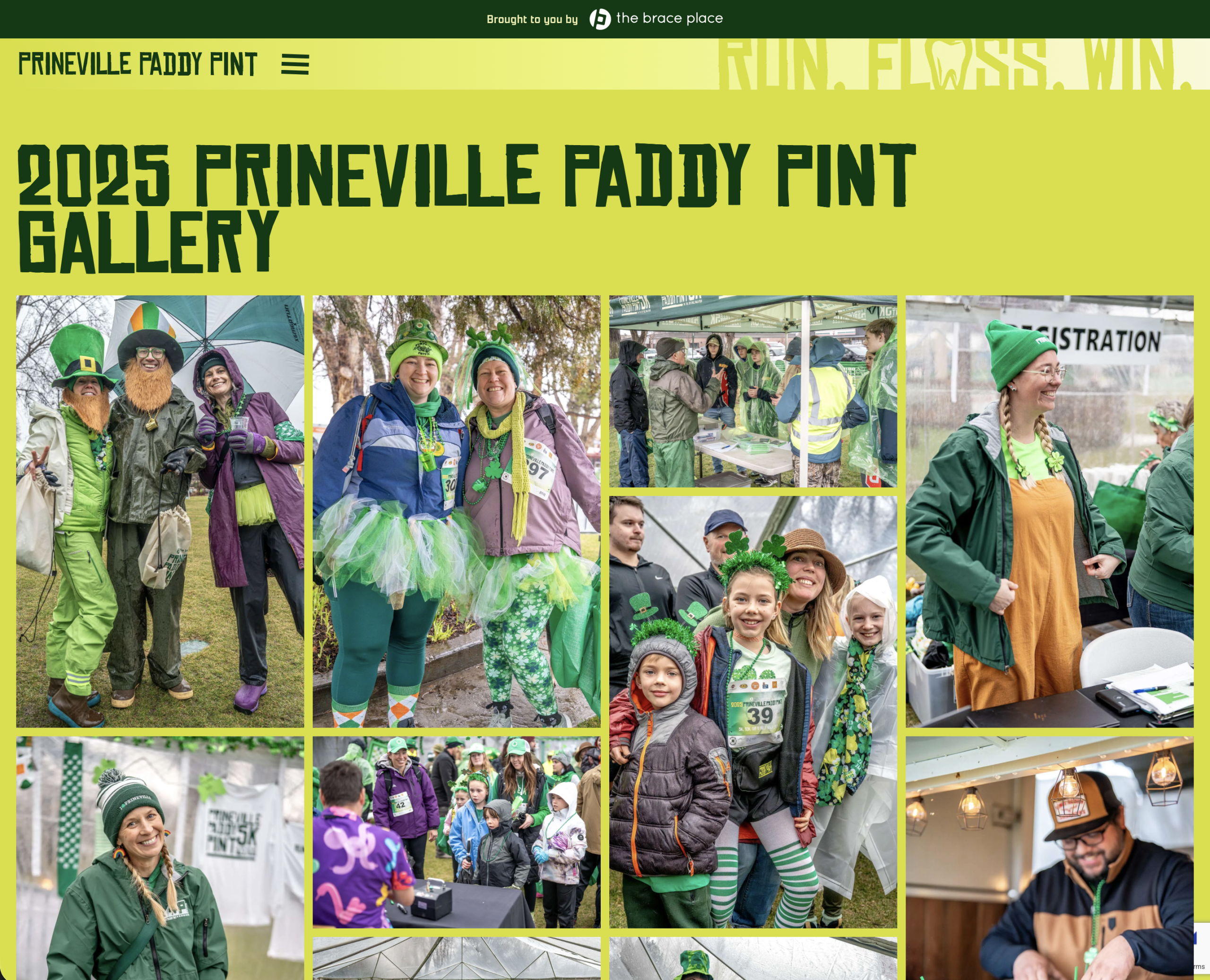
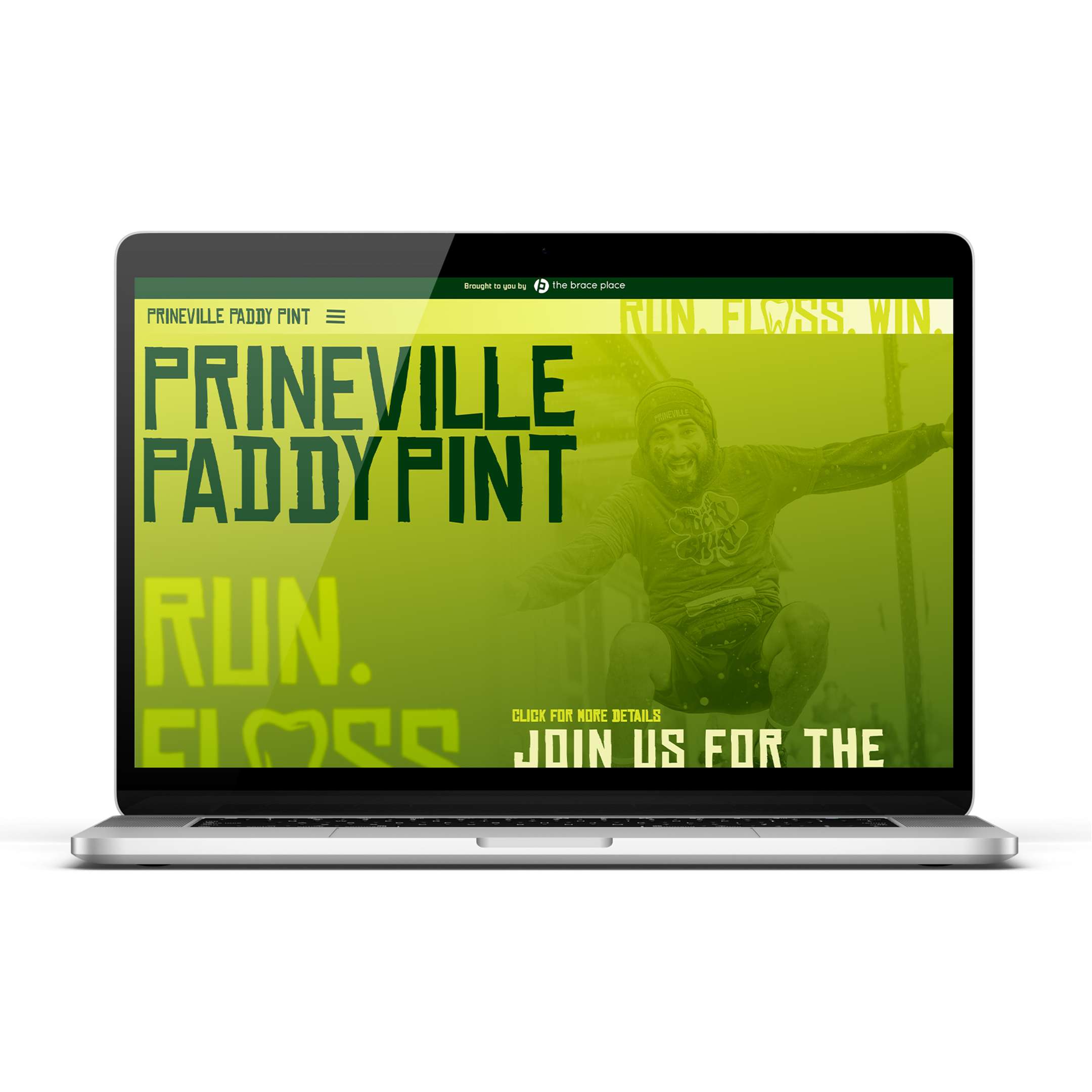
The most recent implementation of the Paddy Pint brand is with a new custom designed and built website. The previous website served it's purpose when online event registration was first added to the event; but it lacked a strong brand implementation and as one of the main places participants interact with the brand, it was in need of updating.
The old site was built on Wix, which for many reasons I have a distaste for, but it does offer a way for non-technical people to easily create a simple website for a small business or event. That ease of implementation comes at the cost of flexibility and customization options, as well as being locked in to a proprietary platform. For the new Paddy Pint site I built it ground up on WordPress and was able to implement a custom design that captures the playful personality of the brand.
CMS: WordPress
Theme/Builder: Pro & Cornerstone by Theme.co
Additional Key Plugins: Gravity Forms, ACF Pro, Yoast SEO
Hassle free maintenance for organizers
The Paddy Pint is organized and run by a team of volunteers. It was mandatory that organizers with no technical design skills to be able to easily make updates to the site. Details such as race information, sponsor management, posting event photos, adding race routes, etc. have to be updated each year before and after the event. Through the use of dynamic content and custom post types, organizers can manage all aspects of event details within the WordPress dashboard—without ever needing to interface with the design or layout of the site.
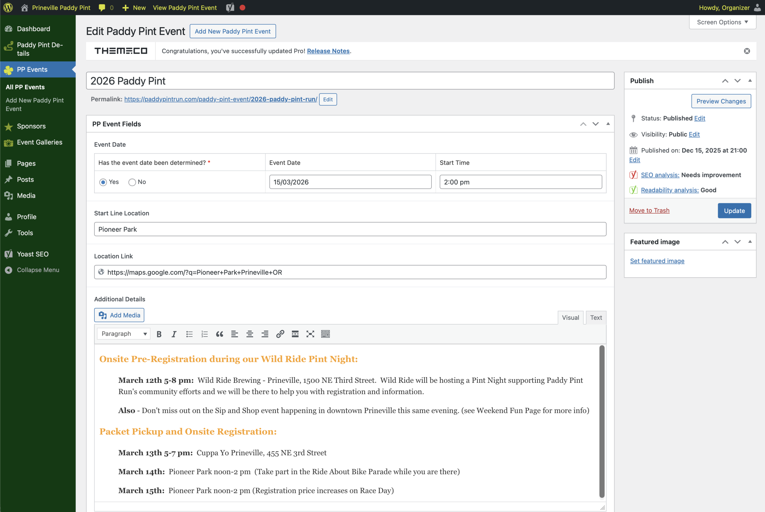
A clean, simple interface for updates, no technical skills required.